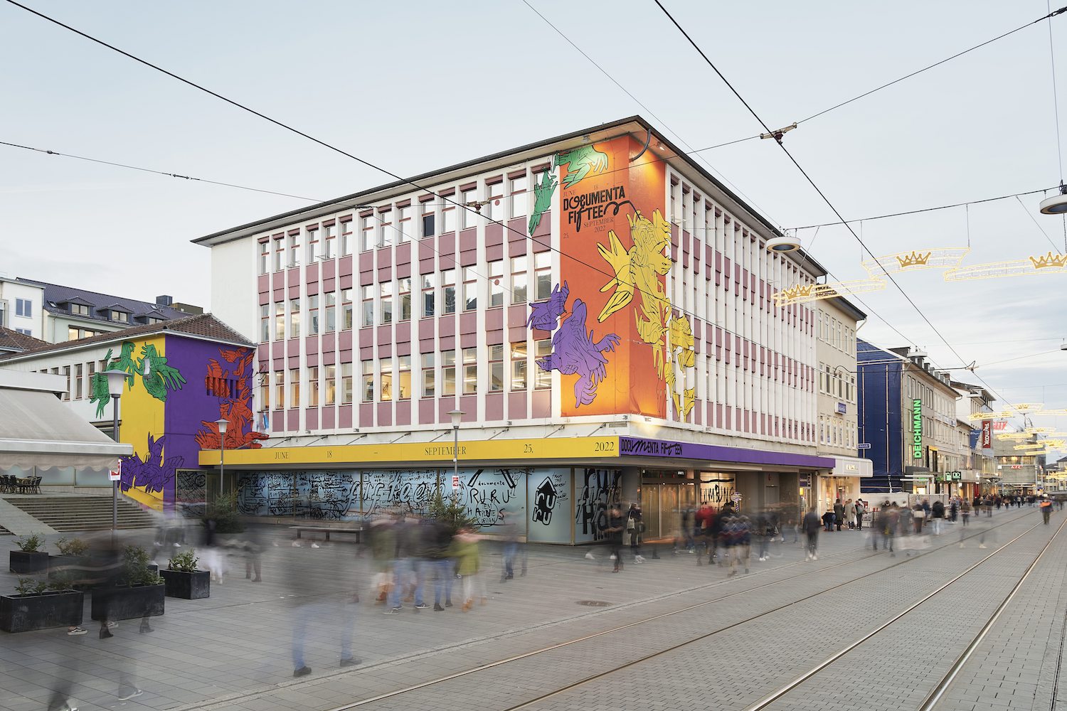
The visual identity of documenta fifteen, which was developed in collaboration with students, is inspired by lumbung. With the symbol of the hands, documenta fifteen’s appearance, which was developed out of the design concept of the Jakarta student collective Studio 4oo2, refers to the lumbung principle on which ruangrupa based its documenta, which is all about collective practices of sharing, solidarity and friendship.
The hands depicted in rope describe a communal society that has no limits and offers a sustainable process for the future. The design’s color palette was adapted from natural fabric dyes used for generations in Indonesia to manufacture traditional textile products. These colors were taken mostly from eastern Indonesia, where lumbung is still active.
ruangrupa itself emerged in the mid-1990s from student networks at the art academies in Jakarta and Yogyakarta. For the artists’ collective, polyphony and the integration of the perspectives of the younger generation is key. Learning from this experience and background, in the end of 2019 ruangrupa invited students from Kassel and Jakarta to take part in developing documenta fifteen’s visual identity. From more than twenty submissions by individuals and groups, two design proposals were selected: from Studio 4oo2 from Jakarta and from kmmn_practice from Kassel. In the process, Studio 4oo2 was tasked with developing documenta fifteen’s overall design identity, while kmmn_practice was given the chance to implement their participatory approach for the visual appearance of the ruruHaus. In the early summer of 2020, the Studio 4oo2 students began their collaborative work with Berlin brand agency Stan Hema and documenta’s in-house designer Leon Schniewind.
documenta fifteen presents its visual appearance by means of a film clip and within Kassel’s public space. Among other places, it will be visible in the form of a large mural by Kassel graffiti and street art project KolorCubes at the ruruHaus, the first venue of documenta fifteen.


