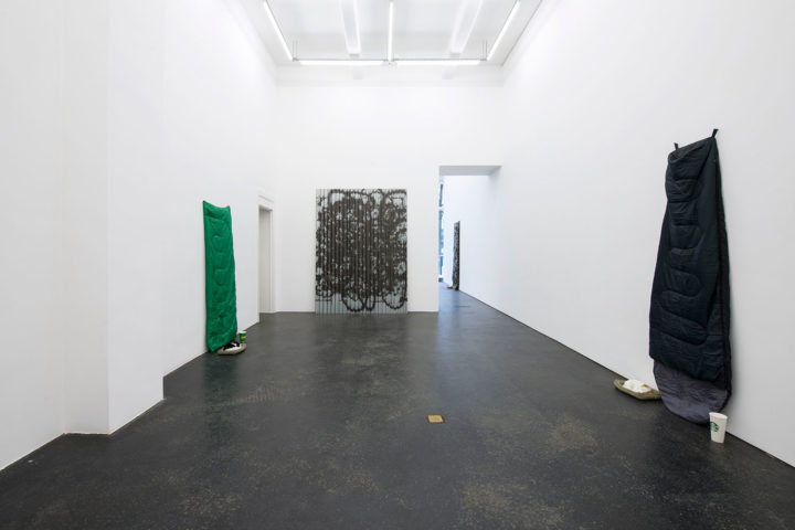
Back in 2012, Keith Farquhar had a show at New Jerseyy in Basel, “Abstract Printings,” that focused on his interest in the appropriation of works produced by other artists. However, unlike Elaine Sturtevant or Sherrie Levine, Farquhar does not intend to create perfect copies of the artworks he references.
Based on one of Morris Louis’s “Unfurled” paintings (1960–61), Abstract Printing (Digital America) (2012) is, in fact, a UV print on birch plywood. Likewise, Abstract Printing (In and out of Wool) (2012), based on Christopher Wool’s He Said She Said (2001), was made using the same process, this time on corrugated galvanized steel. Farquhar’s show at Office Baroque includes a new humorous “tribute” to Wool, Woolmark #6 (2015), which resembles a simple spray-painted graffiti on a found piece of sheet metal. “Iconoclasm is important. I’m a great admirer of both the Louis and Wool works, yet their iconic status doesn’t stop me from treating them with irreverence; cannibalizing their graven image to make anew,” says Farquhar. The interesting thing about this approach is that not only does it question the aura (and value) of celebrated artworks, but also the technology used to copy them: “As the printheads pass over the peak of the corrugation, a normal photographic image of the spray-paint gesture is printed; where they pass over the trough of the corrugation, a diffusion takes place,” he says. “Thus, the image alternates between a digital photographic image of spray-paint and actual spray-paint and back again ad infinitum.”
Also on display at Office Baroque is Ken and Cady Noland (2013–18), which uses a low-resolution image of Kenneth Noland’s 1961 painting Epigram. As a result, the printed brushstroke is highly pixelated. The work is an encounter between Kenneth Noland and his daughter Cady, with a recurring motif found in her sculptures of the mid to late 1990s: a five-holed wooden stock employed as a method of public punishment. For the opening, Farquhar held a face-painting workshop, in which kids would place their heads through the holes of the work afterward and pose for photographs.
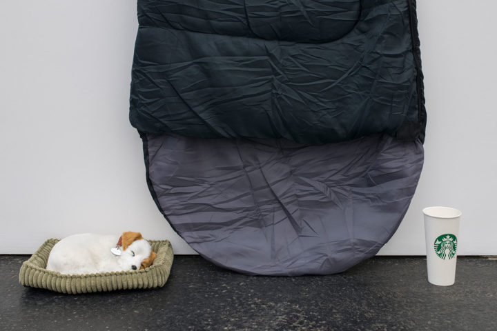
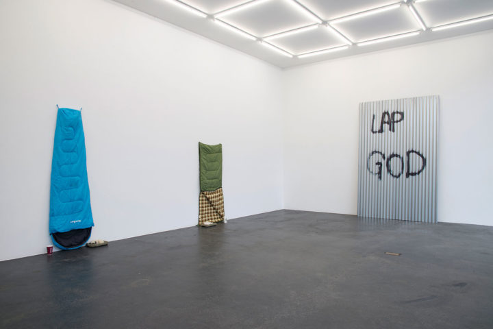
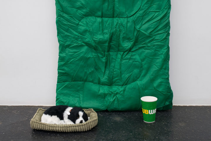
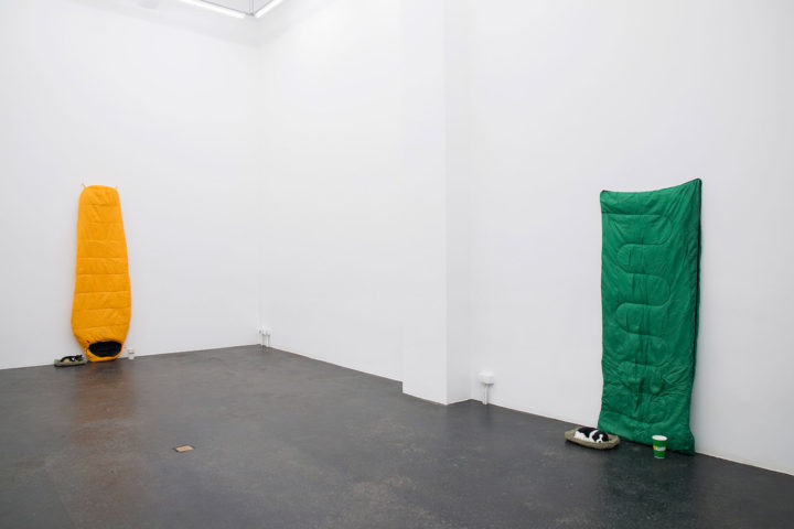
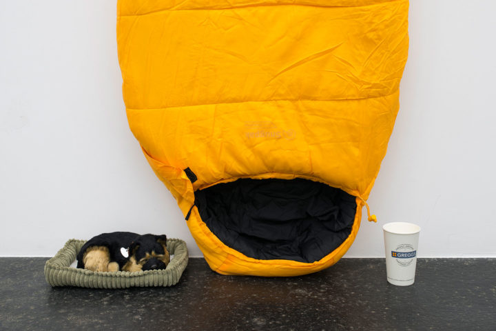
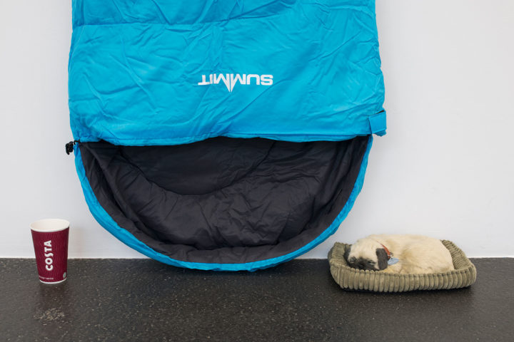
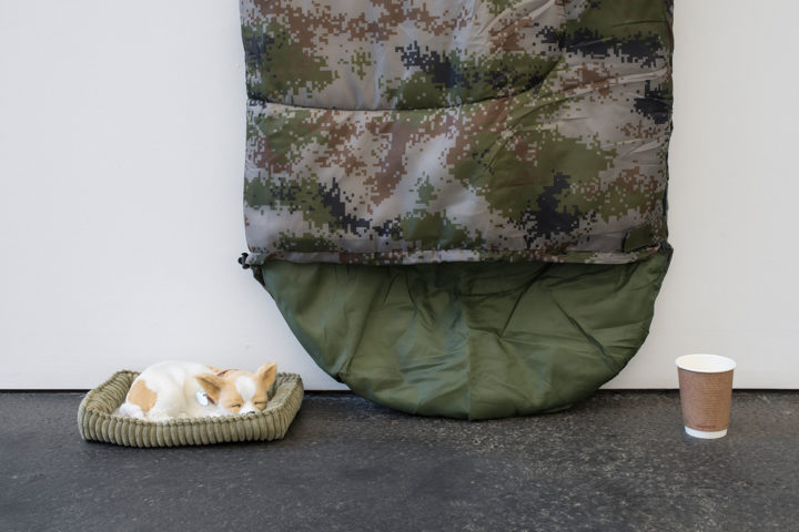
In “Abstract Printings,” all of the printed works create a coherent whole — referring to similar topics in the same whimsical manner. It is therefore difficult to see how the new works created by Farquhar for the show fit into his production: brand new, colorful sleeping bags hung upside down, displayed with a basket holding a puppy dog and coffee cup (a different brand for each piece). The social message of a global economy producing a global poverty isn’t just unconvincing — and Gavin Turk’s sleeping bags produce a more striking effect — but the reference made by the artist to Kazimir Malevich’s “Peasant” paintings from the late 1920s and early 1930s is rather far-fetched. Here, the artist approaches the periphery of the system he has created.