What immediately struck me upon entering the third edition of the Los Angeles Art Book Fair was the intensity. Organized by New York–based Printed Matter at MOCA Geffen, the event took place among a haze of citywide activity: two art fairs (Art Los Angeles Contemporary in Santa Monica and the alternative Paramount Ranch, now in its second year), a free museum day on Saturday, openings, plays, parties, talks, etc. This no doubt contributed to the overwhelming effect of the wealth of Printed Matter at the Geffen, where the masses of those privileged enough to attend tried to take in what exceeded containment, if not consumption. Amid the throngs, investment collecting frayed with gift economies and trade, the visibility of the so-called margins with established art-historical value.
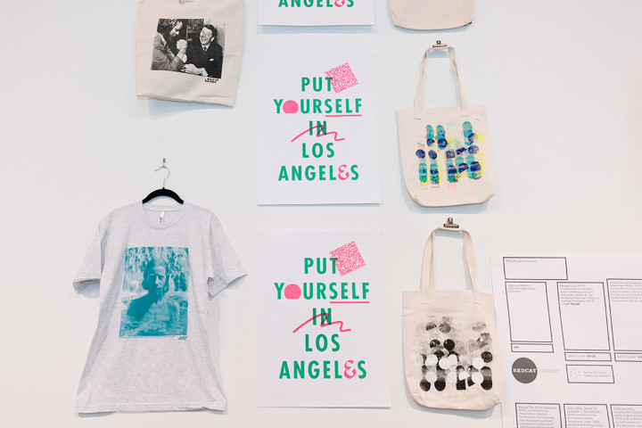
Indeed, the fair hosted 220 international presses, booksellers, antiquarians, artists and independent publishers. A busy schedule of talks, book signings and events was held inside MOCA, and in venues adjoining the museum. Among the highlights were a two-day-long conference on contemporary artist’s books, a talk on the corporatization of the art school, and the launch of the third volume of the performance documentation journal Emergency Index. Inside the fair, the material on view ranged from the rare and elusive fetish, through contemporary high-end prints or limited editions, to zines, totes, records, t-shirts or stickers and patches, with all sorts of material in between. You could find books from New Directions or Siglio, anarchist and collectivist publications and groups (the Public School, the Llano del Rio Collective, the Women’s Center for Creative Work) and journals ranging from Cabinet to Fillip, or a reprint of The Fox 1, 2 and 3 by London’s The Everyday Press. Upstairs, a section was devoted to photo-based books and magazines, with difficult-to-find titles by Super-Labo (Tokyo), or Mack Books and Archive of Modern Conflict (London).
The fair opened on a note of controversy. As a fundraising effort, Printed Matter produced a limited edition of a print by artist Edie Fake, Passageway (Black Lives Matter), a graphic depiction of a courtyard seen from above, or perhaps a government building framing the letters BLM set atop a colorful staircase. Members of the LA art world criticized what they felt was the appropriation of the #blacklivesmatter movement for economic gain, without any redistribution of the proceeds to any of the organizations in question. Further fueling debate was the fact that the critical conversation that ensued had been erased on Printed Matter’s website. A mix of apologies, explanations and conversations followed a program of short films, Black Radical Imagination Mixtape, curated by Erin Christovale and Amir George. Although it did not make a dent in submission to economic pressures, the honest conversations revived some hope in the power of direct and engaged discussion.
Many booths flirted with a range of performative and exhibitionary strategies. Gagosian Gallery hosted a kitchen, offering snacks by chef Mina Stone throughout the duration of the fair, with a cookbook for sale. A book exchange by Warren Neidich reflected on censorship, allowing people to trade red-colored books for books by or about black-listed Hollywood figures during the McCarthy era. A room devoted to Ed and Deanna Templeton’s zine collection delivered pictures of California life to the promise of what was “just one more drop of stuff melting your brain cells.” Most inspiring was the project room occupied by Werkplaats Typografie, a two-year graduate program in design based in Arnhem, Netherlands. Their space seemed filled with the fresh, open, serene feeling of intelligence when it’s collective and horizontal. Inspired by William H. Whyte’s film The Social Life of Small Spaces (1980), the room was a four-day “investigation into socio-interactive-readership behavior,” a probe into the effects of architectural modification on an audience. It proposed a constantly developing response to visitors, from limiting access to the space by blocking one of the entrances, to kicking people out, building a labyrinth or assembling a playground by rearranging the plywood furniture (made by artist Robert Wilhite) throughout the room. When I walked in, the space was a mix of playground and jungle, with its title readable at a slant across a long plywood board set at a diagonal: “People Tend to Sit Where There Are Places to Sit.” Participants, clearly recognizable by their shirts, black spots on a clean white ground, charted the evolution of the room on graphs on the walls that referenced the space through a simple system of stickers in the form of dots. The room also pumped out its own advertising system — white stickers to stamp those who’d been part of the experiment.
Despite its specialized appeal, my feeling after almost four days at the fair was nonetheless one of intellectual and visual excitement, friendly support and a renewed sense of purpose.