Charles Teyssou and Pierre-Alexandre Mateos: You recently opened the art space Sundogs in Paris with the inaugural exhibition “Attention Danger” by Willem Oorebeek. Please talk about the project.
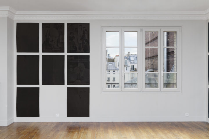
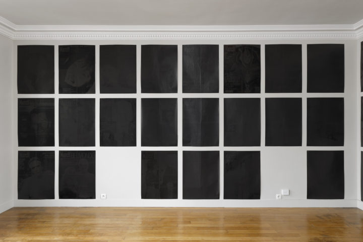
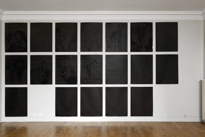
Tenzing Barshee and Robbie Fitzpatrick: Willem Oorebeek is a printmaker who always worked in lithography. In the 1990s he decided to stop reproducing images and discovered the “blackout,” a method of printing black ink over existing materials. One of the first things he blacked out was a poster warning the French population to not look — without protection — at the solar eclipse in 1999. This works lends its title, Attention Danger, to the exhibition. By taking ready-made materials and clouding them behind layers of black ink, his gesture mirrors signage. He calls it an attack against the mass of images — against representation. His method counters the logic of Pop and opposes industrial image culture.
CT/PAM: His works look quite “beautiful.” How does that figure into the critique?
TB/RF: Even though the blackout acts as a symbol against the endless repetition of representation, Oorebeek doesn’t make images disappear solely as a critique. For him, that would be too simple. In his process, the image doesn’t vanish behind the ink. Instead, the black rectangle becomes almost equalized, with traces of color and the contours of the original image pushing through. This leads to a delayering of image information that flattens out its hierarchies. Generally, he only blacks out things that he feels an affinity for.
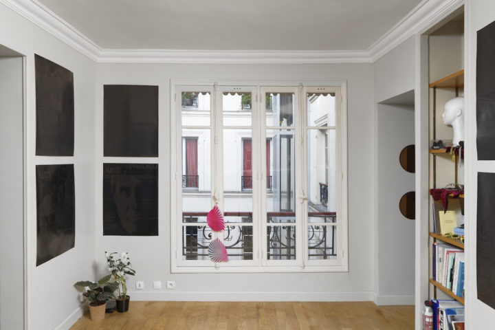
CT/PAM: The bulk of your exhibition consists of blacked-out Paris Match posters. Does the artist care deeply about the French people’s magazine?
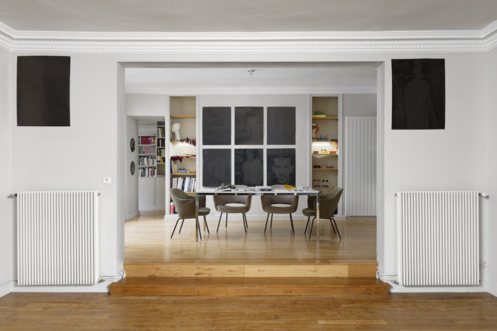
TB/RF: He doesn’t care about the publication’s content at all. In fact, he’s never read an issue. His interest lies in the insistence of its weekly recurrence, the system of information distribution. For him, Paris Match is one of the most convincing examples of how images are aligned with text as a singular unit, and consistently has been since the magazine’s inception after World War II. Between 1999 and 2012, the artist collected posters advertising the magazine in Brussels. At SUNDOGS, he presents a grid of arbitrarily sequenced blacked-out Paris Match posters, covering all available walls with consideration of the architecture.
CT/PAM: A “blackout” describes the switching off of lights — voluntary or not — or the loss of memory. How does that tie in with his project, and why did you choose to start your program with this?
TB/RF: The work suggests an alternative timeline of barely discernible moments in history. But Oorebeek’s project is carried by humor, turning this period, the beginning of euro currency, that is told through faces and catastrophes (the crash of the Concorde, 9/11, etc.), into a caricature of itself: a memory of an outdated Europe. Today, in the interregnum we live in, we are witnessing how these old structures are barely holding up under the weight they’ve accumulated for themselves. This proposal for a different vision of the status quo and alternative models of representation has set the tone for our upcoming exhibition program — not forgetting how Oorebeek not only diffuses his images but ambiguously celebrates them behind a shine of black. We, equally, intend to do both: critique and celebrate.