Vincent Pécoil: With your objects based on the recycling of logos, what is your interest in using printed matter in this way?
Kelley Walker: I am thinking of printed matter as a raw material with traces of history. The logo has an aura of propaganda that interests me.
VP: You made a work showing one of your recycling objects in a collector’s home, which took the form of a bulletin disseminated within an issue of Artforum.
KW: Yes, it was in conjunction with the collective Continuous Project, which was remaking the Art & Project Bulletin, an ephemeral series of mailings that began in 1968. They asked several artists to design the inside and/or back of a flyer that they were to mail out. I went with Jason Schmidt to take a picture of one of the recycling pieces in the home of the collector Marty Eisenberg, and it just so happened that his daughter was having a pool party and we asked the girls if they would pose inside with the work.
VP: What interested you about this image?
KW: When I first made the recycling objects, I was also moving art and installing it in private collections as my source of income. Seeing these collections and the spaces that housed them, I became aware of the difference between how a work of art functions in a gallery and in a private home. Thinking about these domestic settings for art led me to consider the spaces that representations of art occupy as well. For example, with the Continuous Project Bulletin I was thinking about the art object as a printed image sharing a space with other types of images or texts.
VP: The recycling objects are inevitably associated with the notion of appropriation, but you once said that you don’t like this word. Why?
KW: I think appropriation points to or suggests some sort of original — a locatable source that one appropriates and in many ways eclipses. With the Black Star Press pieces (the chocolate riots) I attempt to sidestep a familiar art source, Warhol, as a starting point. Looking back at artists dealing with appropriation in the ’80s, it seems the strategy of replicating in itself became the style or brand of the artist using it. In my works, I don’t escape the effects of branding but think of the processes associated with appropriation as a way of dealing with branding as a social space.

VP: Appropriation became a problematic concept because it has been used as an advertising gimmick by cultural industry. Is that a point of departure for many of your works?
KW: Yes, I often attempt to find parallels between art strategies and marketing strategies. The way Apple, for example, is continuously revamping its products and in the process constructing its consumer base (in terms of need, lifestyle, etc.) is an influence on my thinking about the chocolate riots. Whenever I show these pieces, I shift their physical qualities. They were first exhibited at P.S.1 in a group show curated by Bob Nickas, and the second time was in a group show organized by Neville Wakefield at Barbara Gladstone last summer in which I inflated the image and rotated it 90 degrees clockwise. Then I did a rather large five-panel Black Star Press piece for the Rubells to coincide with Art Basel Miami Beach, in which the image was rotated 90 degrees in the other direction. So there was an attempt to deal with the process of making and exhibiting the pieces as part of a larger social framework.
VP: You often rotate the source image. Is that an idea related to your recycling objects, too?
KW: Yes, in the recycling logo there are arrows rotating forward and backward. More specifically, the processes and effects I use to manipulate the imagery and to generate the silk screens in Photoshop and InDesign are standard and preset; they are the primary tools designers use in laying out magazines and other printed material. In these programs you are given a window, similar to a traditional canvas, with programmed options such as rotating the canvas 90 or 180 degrees, clockwise or counterclockwise. The Black Star Press pieces are an attempt to set up a relationship between these design tools, the printed image on the canvas, and its immediate physical support, the stretchers.

VP: You then silk screen real chocolate splashes on top a riot image. Why did you use chocolate?
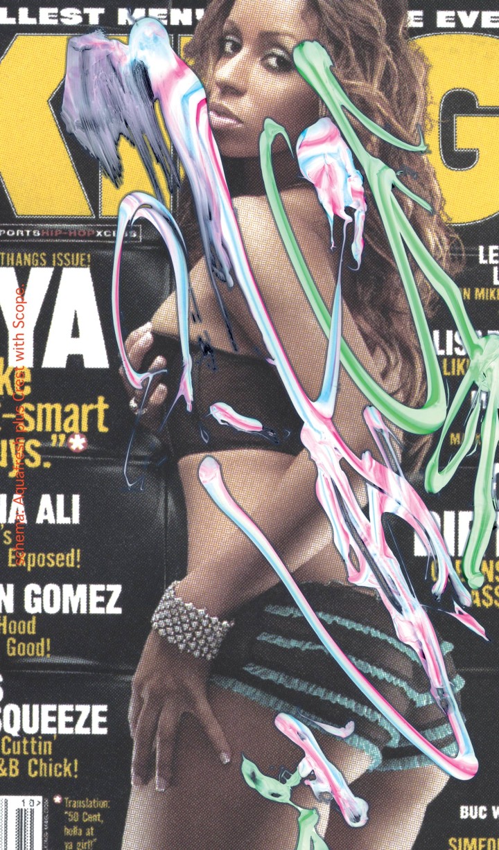
KW: I start by making splatters of real chocolate on glass and scanning them. I then use this digital image to make a silk screen, through which I print chocolate directly on the canvas. An important aspect here is that the chocolate remains constant in the painting both as a material and as a representation of itself, because you’re basically printing an image of chocolate with chocolate. I also saw it as a way of using silk screen like Warhol and Rauschenberg while marking my temporal and conceptual distance from them.
VP: You’ve said you planned to make a Coca-Cola red-and-white version of these works to finish the series. People used to name colors after landscapes or flowers. Yves Klein had his own blue. Today, colors can be brands themselves — just think of Orange, the mobile phone company…
KW: I think anything can come to represent a brand, and I guess the same processes that establish a brand can be used to complicate and open it up to a broader range or use. For the final presentation of the Black Star Press pieces, I’m going to shift the Birmingham riot image from black-and-white to Coca-Cola red-and-white, which was chosen because of the Coca-Cola sign that’s in the background of the picture. By doing this, I am collapsing a color that could too easily signify a product — Coke — with an historical document whose look or style now essentially functions as a brand itself. So ultimately the image gets inflated and rotated, but, in a way, it’s also deflated as well.


