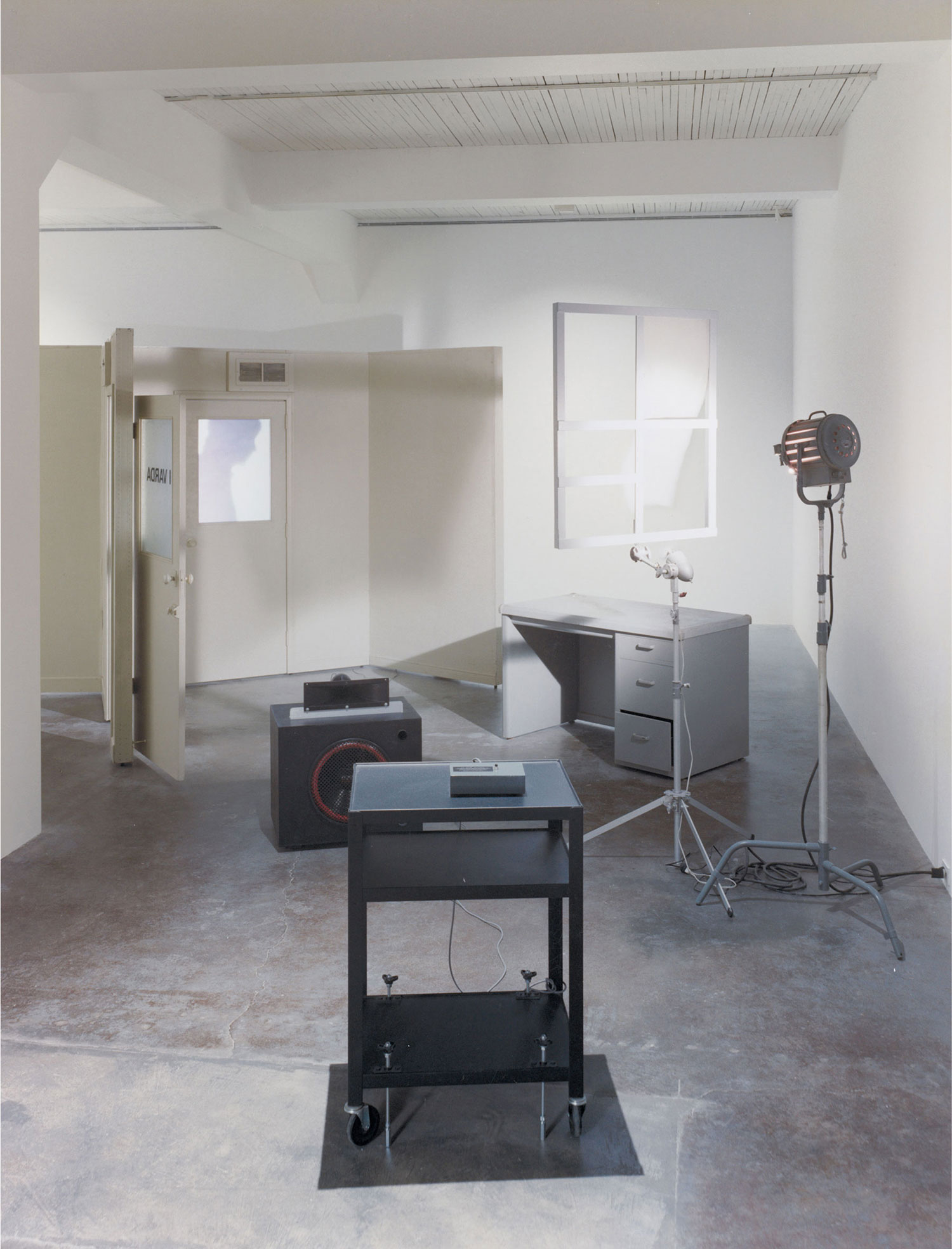
Wendy Vogel: You included a Diptyque candle in the exhibition “Glaze” that you curated at Bischoff/Weiss, appropriating this understated “signifier of ubiquitous good taste” as both a curatorial statement and art object. Can you talk about the intersection of domestic design and minimalism in your work?
George Henry Longly: The show tried to use the artworks to cover the gallery space in a direct and sort of functional way. This approach to the surface and volume of the space aligns with a domestic approach to interiors.
I chose the Diptyque candle because it fills the room with a fragrance and it pitches the tone of the room. Someone referred to the candle as the smell of the collector’s apartment — or even the gallerist’s house, which is probably more precise. Within my group of friends the Diptyque brand has always been a huge joke, the most “lifestyle” of lifestyle brands. Then a good friend bought me one and I did the biggest u-turn on the product. Although it seems a tiny bit perverse to include the candle in the show, I think it worked. My sculptural work resides somewhere between domestic appliances and minimal artwork, hair salon furniture and simple form. I am interested in the exploration of domestic and industrial approaches to production.

WV: You are also interested in questions of museology, theatrical staging and commercial display. How has this played out in your recent sculptures?
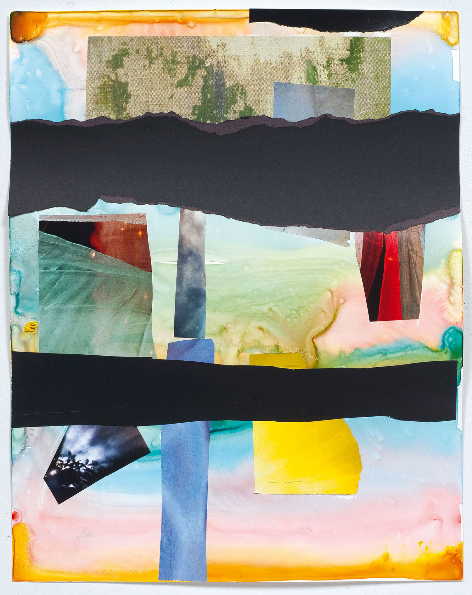
GHL: Like many artists before me and many of my contemporaries, museology and staging are a sticking point. It relates to the heritage of minimalism and conceptual art — the plinth and support structures for art and ideas. The commercial banners that I use are just another part of this, but are somehow more accessible. I use images in my work but I find it hard to generate imagery. My approach to art is more to do with standing a huge stone on its end and walking around it than depicting or capturing imagery. During the summer on a residency in Germany I did a lot of photographic work on the top of the Schloss where I was living. The location provided a backdrop that was stereotypically aspirational and sublime. I worked on the roof because I wanted to shoot in very bright sunlight and use the light to display and highlight the subject that I was working with — locally sourced, slightly colored spring water. The orange tint is its mineral content and therefore the source of its attributed properties.
WV: Your two-way mirrors touch on minimalist design’s application in public, bureaucratic spaces.
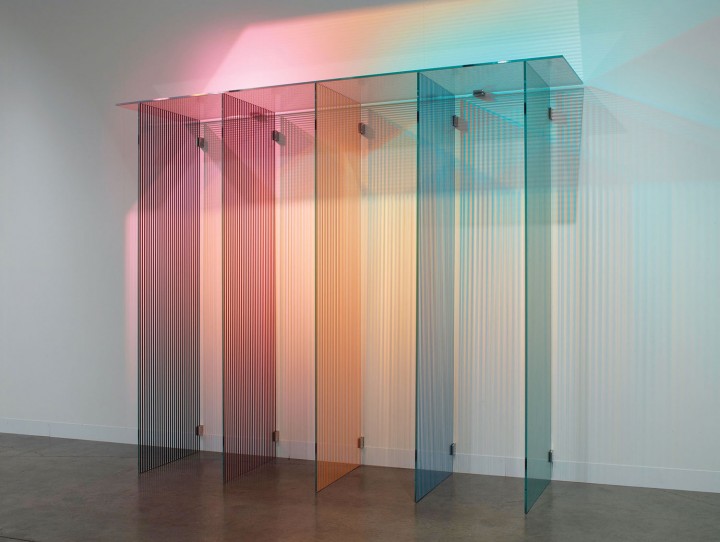
GHL: The mirrors sit in a particular area of design — corporate aesthetics and decorative arts. The mirror is a complex material, in that you are able to see part of yourself and the space in it, and when the works are lit they are activated and become almost four-dimensional. I have used them to metaphorically address the support structure and the ideas that surround the artwork. Because the material is half there, it appears like a graphic sketch from the outside and a semi-visible distorted structure from the mirror side. It makes clear this situation of supporting objects — and the lifting up of ideas.

