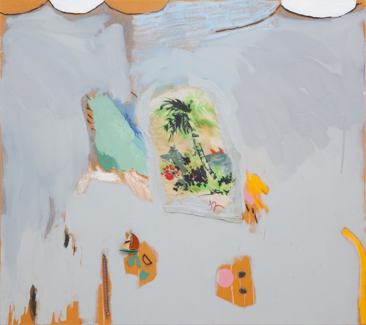
Over the past thirty years, many critics have become used to evaluating the work of painters by their level of disengagement with the medium of painting: “I’m painting, but being ironic toward it,” “I try to keep myself away from it,” “I don’t really believe in it, it’s just a tool like any other,” and so on. Following this rationale, the painter is assumed to be flirting with ghosts, with a tradition to which he does not belong. In order to approach this uninvolved attitude, a lot has been said about the free manipulation of historic forms, and history becoming a huge supermarket of styles available to the painter/editor/consumer. But this notion seems to admit that there was once a mythical, heroic time during which the art of painting was not decentralized, and painters could naïvely adhere to it without disbelieving it. Nevertheless, counterexamples can be found in the tradition itself: Manet and his devotion to and divorce from the past; Tintoretto and his comic hyperboles; Poussin and his marvelous cut-and-paste. We can learn from them that maybe painters have always had this kind of suspicion, this attitude of keeping a certain side look towards their own medium, and maybe quoting forms from the past has always involved both irony and devotion. So it is imprecise to confuse irony and disengagement, displacement and separation, because it suggests that every painting made through the manipulation of an ancient repertoire tends to be cynical and relativistic. Certainly this “end of history” cliché in vogue in the 80’s critique had its raison d’être. But for this reason I would like to briefly discuss the exhibition “The Sun and the Difference”by Ana Prata, held at Galeria Millan in 2014. To me, her demeanor toward painting seems to suggest an alternative both to the painter as an editor of styles, a sterile manipulator, as well as to its counterpart, the recovery of the anti-historical and affected image of the painter-hero.
The exhibition gathered together a considerable number of recent paintings. At a glance, it felt like perusing a chapter of a book on modern art history: primary colors, geometric shapes (or almost) — everything was there. The analytic cubism, the primitivism, the zigzags, the monochrome. Almost all of them in a tiny format, the works seemed to dissolve in the white expanse of the gallery, while at the same time inviting individual examination. Prata avoids the spread-out constellating approach common these days and displays her works in a traditional way: at eye height, only varying the distance between them.
Among the few larger works was Boat ride on the canal (Paul Klee), a horizontal painting two meters high and three meters long. The ungraciously applied light-blue background stains the surface and leaves two horizontal strips of bare canvas within the boundaries of the painting. Over this first layer there is a simple drawing, a schematic representation made of black lines: a minimally articulated silhouette on a boat, water, sky and forest. We are confronted with a colossal Paul Klee. At first, we do not know whether it is an appropriation or an emulation of his vocabulary; yet, we feel the force of this change of scale, which turned a tinted background into huge, ill-mannered stains, and the small, delicate lines into sensuous, American-type brushstrokes. Those like her and me, who studied art by looking at reproductions — small on the page, gigantic when projected — rather than the actual works, are familiar with this state of indulging oneself in reverie over these images; picturing the support, the frame, the surface, the quality of the paint, it’s reflectivity, opacity, layering, it’s small accidents; the dimensions in the captions become abstract, and they don’t mean much: a Klee can be sized to a billboard and a Pollock to a tiny sketch. Prata’s painting, as I saw it, attempted to embody this habit misreading and mis-seeing, by misquoting, mis-painting, mis-everything. The white strips on the borders reinforce the magnification effect, they can be experienced as the blurred limit of a projected image. In the end, the painting exhales a melancholic sense of humor: now larger, the little man on the boat seems even more distant.

Other works in the exhibition also look like small, unsettled quotations of modernist painting. Untitled, for instance, is an oddly small-scaled parody of analytic cubism, much smaller than those by Braque and Picasso in the 1910s, and purged of typical graphic and figurative elements — ropes, letters, numbers, mustaches, cups, etc. Only the surface’s brittle chiaroscuro remains. In works like Form and Brevity, the painted surface is made of raw twine wrapped around the frame. The wood under this rustic woof remains visible on the edges. The loose end escapes, hanging from the picture. It is a crude surface: the brush fails, the paint ventures with irregularity, the relief makes the painting is uncomfortable, fragile. Form, an awkward red grid the same proportions of the surface, suggests a space to be filled or contemplated, though devoid of instructions or illusions, and the title itself guards an ambiguity between the bureaucratic apparatus and the emancipatory modern structure. In Brevity, the zigzag of twine evokes the modernist dynamics of spatial occupation through a swinging line that is delimited by and bounced off of the edges, something inherited from Mondrian’s diamonds, in my opinion, and also recurring in the repertoire of the Brazilian Concrete movement (in Serpa and Cordeiro, notably). The lines traced in oil paint are as thick as the twine, approximately. For this reason, these diagonals don’t seem to be sliding through the surface, as do the precise straight lines of the modernists, but instead they commingle with the materiality of the background, as they could even be one of the woof’s displaced threads. In the paintings of the Concrete movement, the surfaces had to be even (hence the use of industrial paint and hard surfaces) because they are model spaces — abstract, laboratorial plans. As they stress their physicality, Prata’s paintings struggle to articulate these old modern spaces in a world (and in an art world) where they seem to be strangers. In this regard, Gravity is a poignant work: a vertical plan is split in two by a horizontal line. The upper half has a medium-gray background, while the lower one is light gray. Above, a composition with three yellow diamonds and a blue one, bleeding the upper limit. Below, the very same composition, except slightly displaced downward. Both parts are like successive frames of a movie. Individually, each half of the painting suggests flotation (the diamonds over the gray background), while the overall effect suggests falling. The painting is topped by two stones similar in scale to the diamonds, which is why they almost integrate themselves with the small column of forms inside the frame. Magritte would have appreciated it, for the stones push the flat plane down, they try to impose gravity to a modern space.
These works relate to the modernist repertoire in a way that is neither reverential nor nostalgic. Still, they are not simply mocking or cynical. Then what? Prata seems to probe the modernist repertoire in the way that an archeologist faces an encrypted message. Maybe the encounter will only bring the fresh air of a liberating formal invention. But the artist is still quite young, and has only just begun to find these fragments that come to light: ill-mannered, broke, encrypted, like corrupted files, shining the light of long-dead stars. Where someone once dreamed of a flat grid, we might come across a labyrinth.


