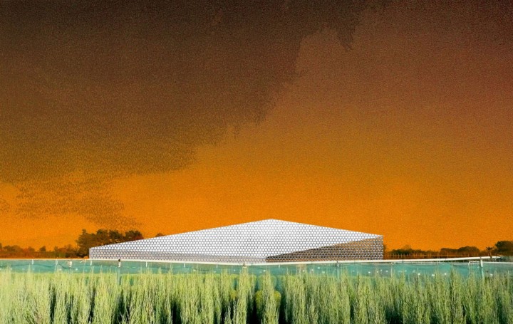
In “Small Museum for the American Metaphor,” curator Kersten Geers calls on a slew of references from architecture, urban studies and US history. Yet the more palpable aspects of the show can be found in a single proposition: How might architecture renegotiate its own terms through the aesthetics of contemporary art? Thankfully, the show goes beyond presenting scale models, CAD drawings and the now germane parametric installation as Art. Instead, Geers attempts to initiate a discursive relationship between architects and contemporary artists that share similar interests in form, material and industrial spaces.
There are photographs by Christopher Williams, sculptures by Rita McBride and objects that occupy the nebulous space between art and industrial design — see Ettore Sottsass and Jonathan Olivares. Architectural historian Reyner Banham’s now canonical 1971 text Los Angeles: The Architecture of Four Ecologies is also on display, placed casually on the floor aside Manfred Pernice’s Apart 5.1 (2009) — one of three imperfectly constructed sculptures composed of plywood and ornamented with cheap plastic rackets, spray paint and paper notes. In spite of their schlocky appearance, these assemblages convey a kind of structural familiarity, reminding one of museum pedestals and ancient ziggurats. Similar qualities manifest in the coruscant partitions that hang from the ceiling and divide the gallery into separate “rooms.” An apt counterpoint to the stainless steel panels of the Gehry-designed Disney Concert Hall, Pieter Vermeersch’s commissioned piece is actually made of wallpaper and dictates the framework, as well as the reception, of the entire exhibition. Form supposedly follows function, but in the context of an art exhibition, these inexplicable and unsightly panels express more than walls or curtains. Instead, the fluid wallpaper becomes an architectural formation that one can push aside and against with ease.
If unstable, dispensable materials suggest the low of consumer culture in one sense, lowness is spatially literalized through the strategic installation of works. Framed photographs sit on concrete, while scale models are placed, sans pedestal, directly on the ground. Black vinyl numbers are also floor bound, identifying each object in an accompanying works list while also casting a moment of anonymity over the show. After all, how would one know which objects were born from art or architecture when buildings are rendered as models are rendered as artworks are rendered as furniture, as in Sottsass’s Hotel California — a tall, trebled structure of green, yellow and red that is indeed a functional cabinet. These visual metaphors hinge on a kind of scalability, not only of size but also of form, material and the subsequent aesthetic expectations of the viewer within a given context. This point is not lost on Geers and becomes the playful crux of his “small museum.”

