A baby and a great fear of meeting my past stopped me from returning to London for almost seven years. That is also why, until I entered her studio at Gasworks — the nonprofit institution that has hosted emerging artists since 1994, including Chris Ofili, Lynette Yiadom-Boakye, and Goshka Macuga (what great years those were!) — I had not yet had any in-person encounters with the work of Zeinab Saleh. A clean white corridor connects all the studios at Gasworks, leading to a communal kitchen overlooking giant cranes and excavators at work on another monumental compound. The fragmented but still-open London skyline will be covered over for the eyes of a new generation of artists in a couple of years. In this context of constant flux, Saleh’s delicacy of movement and gesture is translated into paint. Through a vocabulary of wind and light and symbol, her language is still, and her imagery whispers all sorts of sensations. We discuss her work while looking at earlier and more recently finished canvases.
Gea Politi: You work a lot on layering. Is there a specific action or thought that you employ when developing a painting? I feel there’s a potent sense of wanting to hide and then rediscover different layered surfaces.
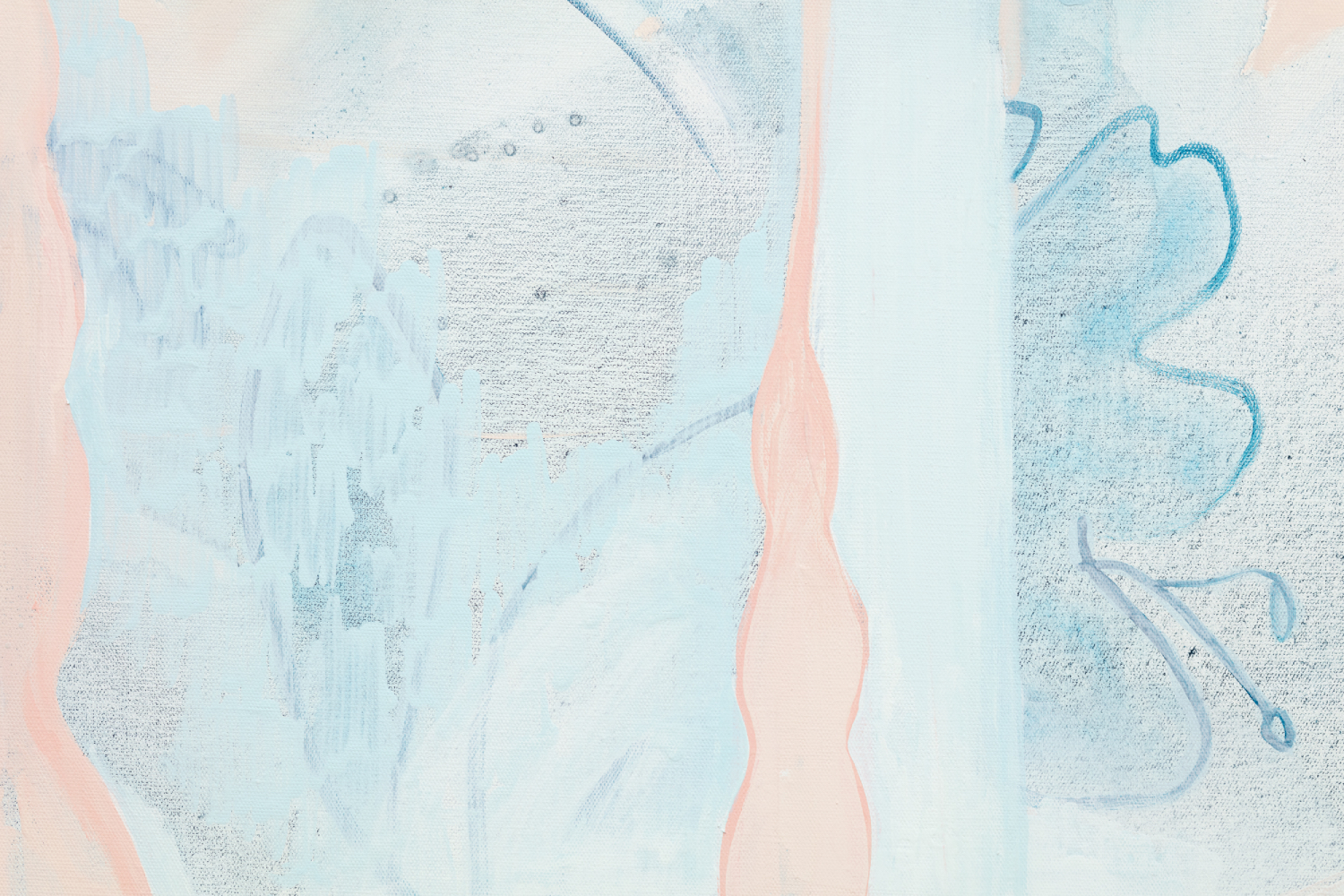
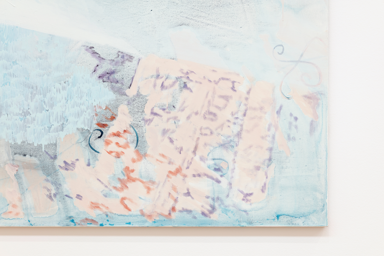
Zeinab Saleh: Yes, different thinner layers. And then, I try to keep some of those thinner layers in the painting to create that sense of depth and leave all the traces of mark-making behind. I think it adds to the luminosity, it feels like there’s light coming through the paintings.
GP Had you begun your practice thinking about layering? Was that a sort of initial thought that you had in constructing a painting, or did it happen over the years?
ZS I think I want there to be lightness and a sense of calm in the paintings. I use quite a muted palette, and try to think about the atmosphere in a painting. With the charcoal works, they feel quite moody, and they have this kind of mysterious, nighttime atmosphere, this mist to them. And then, I wanted to challenge myself and work with lighter colors, more color in general, with this show at Tate. I think this is probably the most colorful show I’ve done. My solo show at Camden Art Centre had a lot more gray tones, more monotone, and I try to use acrylic paints and chalk and mediums in the same way to create texture. I think, sometimes, working with a limited palette forces me to change the ways that I’m using the material and really stretch out what the material can do.
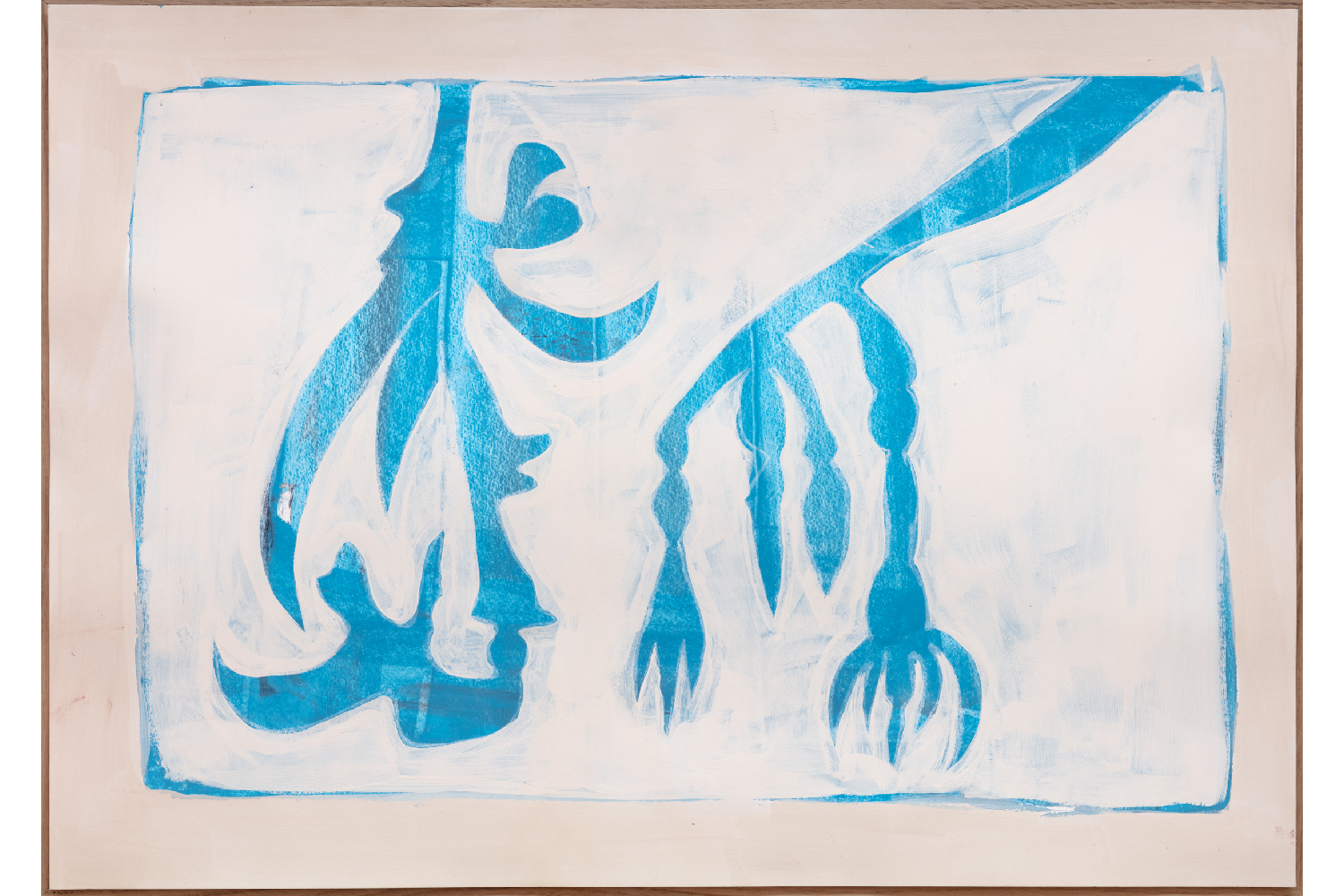
GP When you showed us a few images on your laptop, there were some paintings that were quite figurative and others that were more ornamental. But then again, in your more figurative paintings, you have this sort of ornamental subject matter coming up. Would you say that is the fil rouge of your practice? Is it an important aspect of it?
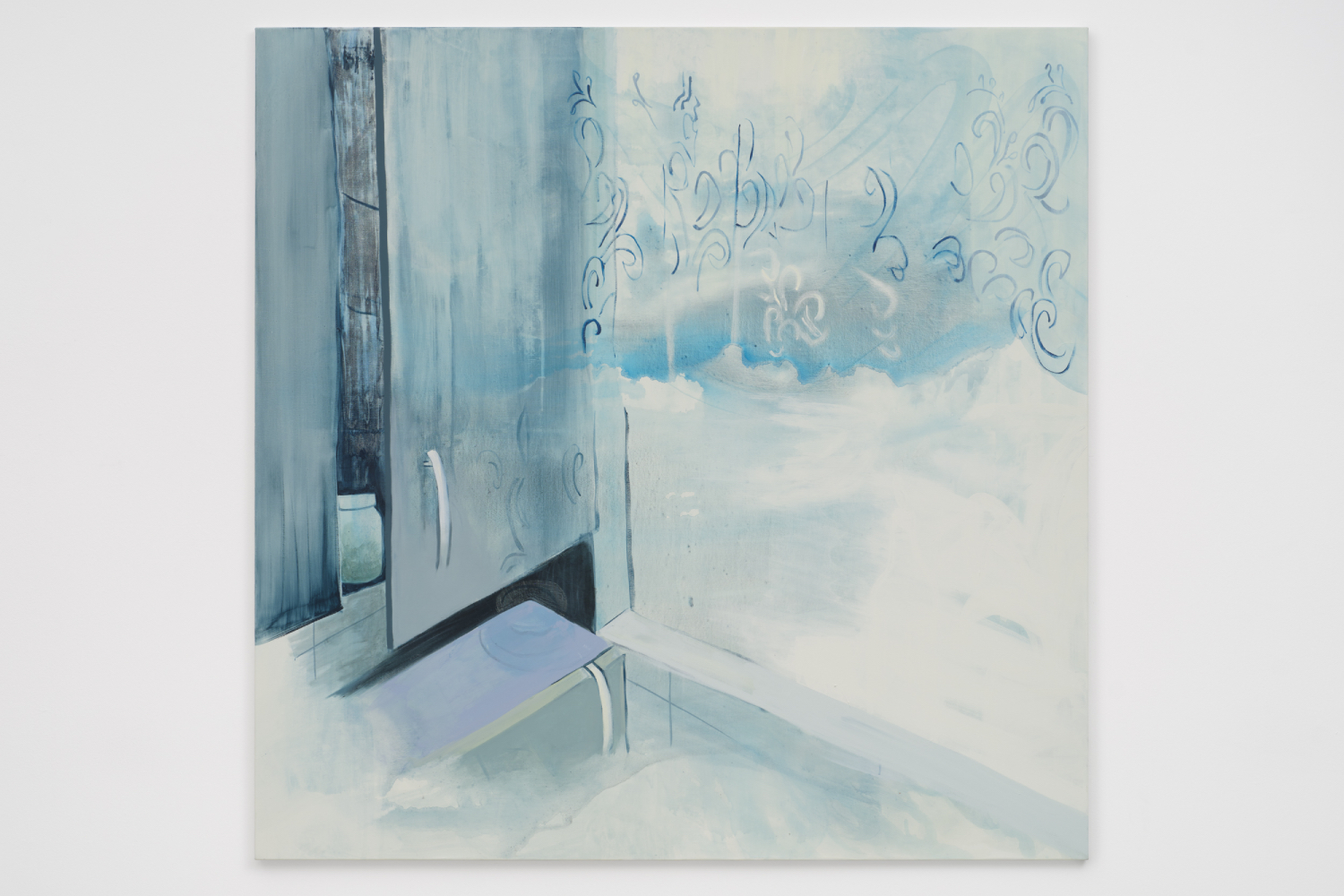
ZS With the show in general, I’m drawing from things in my home. I’m drawing a lot from my everyday spaces. This door is my living room door, and I have this prayer mat over the door all the time just for ease of use. And these mats as well. I think it was during Ramadan when my friends and I were fasting. We broke our fast together and had our mats of different colors. Although they’re ornamental and have patterns, they still do have a use. And I think it’s about making everyday life beautiful for you.
GP But then you come up with these other extra layers that are not part of the actual space in your home.
ZS Totally. The starting point is a real space, but it becomes more fluid, and the forms kind of morph and mesh into each other. I think the ornamental moments have a use: this curtain on net lace is for privacy, and these mats are for comfort and cleanliness when you’re praying. But actually, this is my everyday, and if another person were painting their everyday, it would probably look very different. I’m coming from my own world, and that’s different from everyone else’s worldview, of course.
GP This is the first time I’ve seen your work in real life. I’ve seen it through my laptop, but still, its perception is completely different. You try to give a sort of code, or you try to think how to define it or find a new definition. But what’s clear is that there’s a very strong signature; it’s the color palette that gives you this idea of calmness, of reset. In a way, when I’m in front of one of your works, I reset. I try to imagine the moment I step out of this zone, and then I go out into the streets again and hope these colors follow me.
ZS I definitely get that with the prayer mats. The other day, I was putting something in the boot of a cab driver’s car, and I saw the prayer mat and I thought about the painting again: the forms follow me outside and into the world. I think it’s really nice to look at things differently again with that eye. Even when I’m looking at plants and metal railings, I look at them as something I’ve spent a lot of time painting, so I have a unique relationship with them. When I’m out in the world, I have a different encounter with those objects.
GP At first glance, your work may look dreamy, but it isn’t so. It’s very present, very real. I think it opens your eyes to a different dimension, but it’s a very tangible dimension. Culturally, it’s incredibly impactful to your eyes, even if, in the beginning, it gives you this sort of calmness with its different color palette and new ways of seeing things.
ZS I think the muted color palette allows you to focus on what’s happening in the scene rather than creating a concrete world. I do try and consider feeling and atmosphere in the work rather than just this kind of concreteness.
GP One of my favorite works in this room is the one with the swans. Can you tell me about it? Is it finished?
ZS This one is finished and is very different from my usual paintings. I’ve kind of had a break from some of the swans. I don’t know how you read it, but for me, it’s like a car. And then these haunting swans in the back. I think in the past, swans have felt romantic, and I wanted to create a bit more tension or airiness with them as well, just so they have character development character development like a film. You can get character development in the narrative. I don’t know if it works in that way, but these two are a fun new direction. I could probably show you another one that’s very recent. So, this is also a new one with these colors, and it’s a lot more vibrant. This one is similar to the other one, but in a yellow tone, and for me, these two sit together. I see this as one, and then that is in another conversation. For a long time, I was kind of moving things around. And then, when it came to the show’s installation, I wanted the painting The sovereignty of quiet to be the anchor in the centre of space. I had a little bit more than needed for the show, so I could have an editing process when it came to it. But usually, when preparing for a show, I really like to do things more analog and move things around physically while planning out the space.
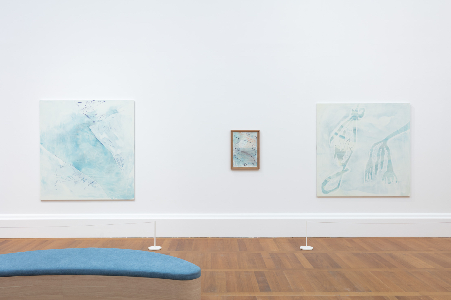
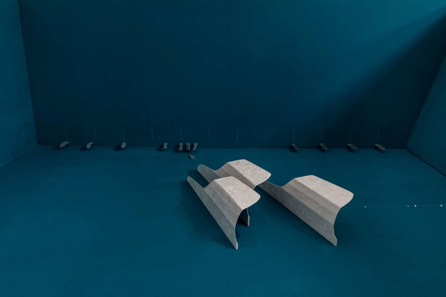
I also have these drawings, which for me, I’ve kind of placed strategically to interrupt that easy flow of seeing everything at the same eye level. I think sometimes, in a show, it’s easy to just do a very simple loop, but for me, I hope that the breaks with the drawings create a kind of more active viewing and force the viewer to encounter the works in a different way. Create more movement in the space. There’s also sometimes two paintings and then a break and then another painting. I think I’m just trying to interrupt the “easy flow,” because it’s tricky in a museum like Tate Britain, where you have so many rooms and so much work to see. And I even do it myself. I just circle through quickly, because I want to take in everything rather than really looking closely. I’m hoping that those interruptions and the seating that I created, these two crescent moon seats, encourage people to encounter the space differently. And the seating is purposely made for the show. So, hopefully, they can see those connections between the patterns and the chairs, and it encourages downtime, which is very tricky in a museum.
GP I think when it happens, it’s magical.


