David Kohn: We’re here in your studio where you’ve been working for almost sixty years. The paintings are all gone and the house is now empty because you have two big shows on. You described the Royal Academy (RA) show as an extraordinary opportunity as the first female painter to be given a show there. I wondered if you could say a little bit about how you conceived of the show?
Rose Wylie: The whole business about being invited to show was terrific. Cornelia Parker understood the historic situation of no woman painter showing there before, and she put it together, she pin-pointed this fact, verbalized it, and she pushed it, and she got it going. I mean, thank you, Cornelia. It was hugely exciting for me, but I want the work to be understood as painting, and for me to be understood as a painter first without being put in a box for being a woman, or being the first. That’s actually neither here nor there. What I want is people to respond, to feel, and to sense quality, or not, in the painting.
DK: You have made the point that the show is paintings, in a gallery designed for painting. The proportions of those spaces and the daylight are wonderful. About half of the work shown is quite recent. The scale of your paintings is striking — were they made for that scale of space?
RW: No. I’ve been doing big paintings for a long time. When I came back to painting, it was still very male dominated and female painters were somehow marginalized. And so to make big paintings seemed like a good way of showing equality, confidence, and self-belief. Thinking of the Renaissance, there were big paintings with status in the churches and palaces — up the wall, along the ceiling, frescos, mosaics around on the floor. The early Renaissance had that freedom. Only when they became preoccupied with the singular skill of representation did they lose that freedom. Today I think paintings have had a bit of a shabby deal because they are usually quite small oblongs on the wall. So I did big paintings.
DK: It’s been a long time since I’ve been in the Royal Academy where there is a painting show that fills it, works room by room, and has paintings that are suitably scaled. You realize that is an optimum situation, but one that’s very rarely achieved.
RW: They are thoughtful and considerate at the RA. They come and they say, “What color do you want the walls to be?” I thought white — hard industrial white, not toned down with tasteful designer grays — firstly because I work on white walls, secondly because when my work is reproduced on a page, the page in a book is usually white. I thought about the walls of the RA where the ceiling are white, and that putting color beneath would cut the space in half. As an architect, you’ll understand. The rooms have ceilings, yellow molding, and walls. Why divide it with a color?
DK: They’re day-lit, highly articulated architectural rooms. Historically they would have been colored, and in recent years there’s been a fashion to color gallery interiors which would have been white before.
RW: That’s just fashion. It has to be nuts. I think painting the rooms white gives them coherence and scale. Somebody said the walls of the RA are looking their finest, but I think that’s because I’ve allowed them to join up and come together.
DK: What comes out in the way you talk about your process is there’s judgment. You’re looking for a certain kind of coherence that some might call balance.
RW: Yeah, something which comes together in the right way. It used to be called composition. You’ve got to get the thing together, and each painting, apart from the bits in it, has to be realized as a whole image. In a funny kind of way, you’re not thinking about that when you’re doing it. It’s not about an event, it’s not about confrontation with the canvas, you just have to get the paint on ok. So at that point, composition (or construction or whatever you call it), goes out of the window. I think of it as let it work if it works, but it has to be right in terms of the whole thing. I mean, it’s no fun. I can tell you it’s a difficult business.
DK: I think the difficult business is because you’re consciously doing work within a historical context. Which means that I suspect the pain is derived from your judgment about whether it qualifies, which is hugely demanding.
RW: My judgment, my aesthetic, whatever you call it. Discernment, whatever. That’s going on all the time. I mean, it’s not a shriek in the dark or a cry. It’s trying to do something, as you say, within a context, but not just a historically canonized one.
DK: I suppose maybe composition in the context of painting is a rather backward-looking preoccupation. But if one uses it for music, one feels a little freer and it feels that it has more currency.
RW: And repetition is another one. Brahms goes backwards. I just thought the whole cultural thing, it’s not just visual — it is, but it’s also making something with that.
DK: You have pointed out that the paintings have these colored pencil lines around the edge, and that’s part of how you present them. Could you say a bit more about that process?
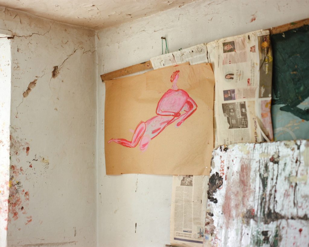
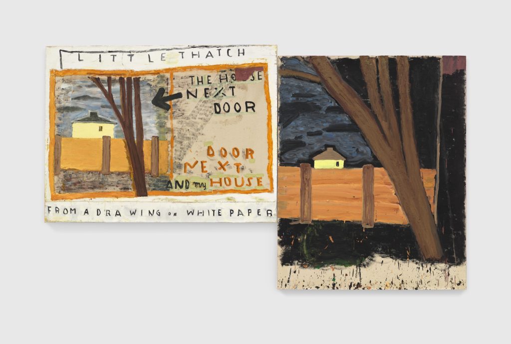
RW: I think it’s because it was quite something from the beginning. You’re teaching, you’re living, you’ve got no visibility, you haven’t got a lot of money. So you don’t go through the business of buying pre-stretched canvases. Instead, I get a seventy-two inch roll of heavy canvas, and I’m working on the floor, so it can’t be flimsy. It’s flexible, I can cut it into different sizes, and because they are directly either on the floor or stapled to the wall, without thinking, I mean without control, I paint to the edge of the canvases. Then when they come to be stretched, if you leave them like that, you lose three inches around each side. That’s no good, so I did a ruled, colored-pencil line down the length of a new narrow-strip of canvas, so that whoever my assistant was at the time could stick the canvas up to the colored line and get it straight. I also liked the colored line to show; it was the kind of final statement. It’s like saying this painting is finished. It’s like the sculpture is now cast.
DK: In your working with fragments, inevitably one creates certain hierarchies within compositions, and there’s this moment in the studio where you can bring things into relationship through the process of assembling paintings from fragments. The viewer reads them in a present-tense way, as having the direct relationships they see. But you’re saying that, actually, they may have been made at different times.
RW: It’s a chance coming together. I stored them easily because they weren’t stretched. They were bits of canvas, so they could heap up here on the floor. Huge piles. I used to flick through them, and in doing that, different juxtapositions would come up, and you’d think, oh, that’d be quite nice. Chance is often acceptable.
DK: I felt that all the way through the show, that there’s a kind of mapping going on. Many of your paintings have a map-like quality, which maybe I also connect to how diverse the content is. But then this idea also made me come back to the first room at the RA show with the maps of London, which were the most literal of maps. It made me think almost like your work is urban and it’s able to accommodate a city’s heterogeneity, which a lot of other art practices would rather sew up into something singular instead.
RW: Openness — I hope that’s its strength.
DK: I think ordnance survey maps are absolutely fascinating because so much thought has been put into the graphics, like the type of line and how it communicates, in order to make them highly legible because they have this important function to be efficient in their transmitting.
RW: There was something else I wanted to bring out to you. When you find a form, whether you do it with tone or whether you do it with a line or whether you use cross-hatching, it is about mapping of some sort. I’ve used it on hair styles where there’s a wave. I’ve done exactly that. It’s also like the backdrops in theater. I’ve done a ballet backdrop in 2024 and it’s got to be read from a distance as well as close-up, and it’s no fiddle-faddle. It’s got to be clear, which is what I like.
DK: Which is both literally theatrical, and interesting in describing parts with great clarity.
RW: The line too has to be right. Whether it’s fuzzy or thick or double or whiskery or thin. The line is very important and the high Renaissance doesn’t use lines much. The early Renaissance people do as well as children and medieval art… it’s about directness and clarity and about, again, the choice of line you use.
DK: Well, I guess the line is also a way of explaining what is and what isn’t, what is in and what is out. It’s almost like giving importance to the description of that relationship.
RW: It does do that. “Importance” is good, but as well, it does your division thing between the inside and the outside. But, the image, the subject, is not the “all.” It’s really a question of where the artist sees quality. You can see quality anywhere: somebody walking down the street, what they’re wearing, in a small flower, in a bird. It’s absolutely consistent that it can turn up anywhere. It is me seeing quality, a moment’s excitement of quality out there that I hope, with luck, might turn up in the work. So of course, the subject comes out different, and varied, because quality is all over the place.
DK: But maybe the reason the heterogeneity is remarked upon and maybe a reason the work has such currency is because plenty of art production excludes that kind of richness in favor of a more narrow, conceptual attitude.
RW: It’s a cool thing.
DK: Exactly. And I think what you’re saying is that your purpose is not to show that degree of diversity, but that being open to quality in this way is generous, and I think that is what also gives its urgency and its timelessness.
RW Yes, it’s timeless because at any point on the television or in a film, you can see something which relates to a much earlier time. Or you can see it in a museum. So you just bring it in to the work. Time doesn’t separate. That’s why I call it “trans-temporality,” which is a word I like. I made it up, by the way. I don’t think it’s a proper word.
DK: Trans-temporality: it makes you think of “anachronic.” Alexander Nagel’s Anachronic Renaissance (2010) is a book about Renaissance painting that actually has a lot of relevance to architecture. I think your work is dealing with the same ideas. It’s what we talked about in the early Renaissance paintings: that some types of painting are interested in the history of painting being present at the moment of encountering the new work. I think you’re referring to all paintings being co-present in your painting when they share content or fragments. And I think that’s why when you say I’m interested in the early Renaissance, I don’t think you mean as some kind of bygone style. It’s actually that one can encounter it through your painting. It’s revisited.
RW: A Christian trip!
DK: But that is a very particular idea of what quality is, which I would suggest a lot of art practices deny or exclude, partly because there’s been interest in denying this kind of folding of time.
RW: I’m not denying it. I use perspective, I use cross-hatching, I use foreshortening. I know about it. I see it… I’m a trained artist. I mean, I was an art student. I’m not somebody who’s come new to it, so I use it, or not… a tool; I think that’s important. So if people just fasten on the fact that it’s humor or childlike, that’s loose thinking, and that’s why I say I’m serious, because in fact, research, and investigation, into history of art, philosophy, literature, language and film, has been filtering into my painting for as long as I can remember. It comes together, unlooked for, in a very organized way. In a painting, or in a drawing, I keep going on over it — if it’s not right, I redo it. It has to “look” right and “be” right. So the handling is fresh because it’s just been done, but there’s been a lot underneath it. It’s not jejune or thin. Because I had a certain amount of visibility, certain words are being imputed to me, and one of them is humor. The thing is, I don’t do humor. I am serious. I’m a serious, fine art painter. I think it’s difficult to put your finger on what the quality is that I’m doing. Roland Barthes has this idea that says quality in art is difficult to put your finger on.[1] I hope that’s what I’m trying to deal with, quality and painting. And if certain things come together, which in fact, Surrealism has done, Dada has done, then there’s nothing new about that, but people seem to find it humorous. It isn’t quite humor. It’s perhaps a quality that they’re not quite sure about, and so they call it humor.
DK: I can understand that the pleasure can be misnamed as humor, but the pleasure is one of cognition. So there is maybe a kind of mental process which is a certain delight, but maybe the delight comes from a degree of serious significance.
RW: If it is serious significance, I’m happy.
DK: A quality that I could see is you’re apparently very keen to give the parts of a painting autonomy as well as giving the whole its set of relations. That’s got something to do with fragments, really, in that the fragment has an autonomous role in the painting, but then it also is active in relation to all the other parts. Yet when I hear you talk about the early to late Renaissance, there is this kind of clarity. Each of the parts has great presence on its own.
RW: Well, this is what I want. I want presence in each bit, if you call it a fragment. And also I want presence in the whole.Can I talk about perspective? There’s a painting in the RA show, it’s called 3 Seating Plans and Seated Table (2025). There’s a table on the left canvas and in the table the perspective is getting bigger as it goes away. Now people call that childish. That is not childish. It is Eastern perspective. On the other hand, the candles on the table get smaller as they go away — that’s Western perspective. So I’ve put together Eastern and Western in the same painting. Do people see that? No. Do they say it’s this? They say it’s childlike. So I say, just look again. It is not childlike. Can you understand the irritation?
DK: But I think what is clear is that any part of any painting can unlock that analysis if one’s willing to see it.
RW: Well, I think the Greeks had this idea that the painter is showing us a view of something which we know but haven’t actually seen. From my point of view, it goes into something which I call poetic transformation. I’m not doing realism — and that is like the early Renaissance. It’s less “real” but they’re both good.
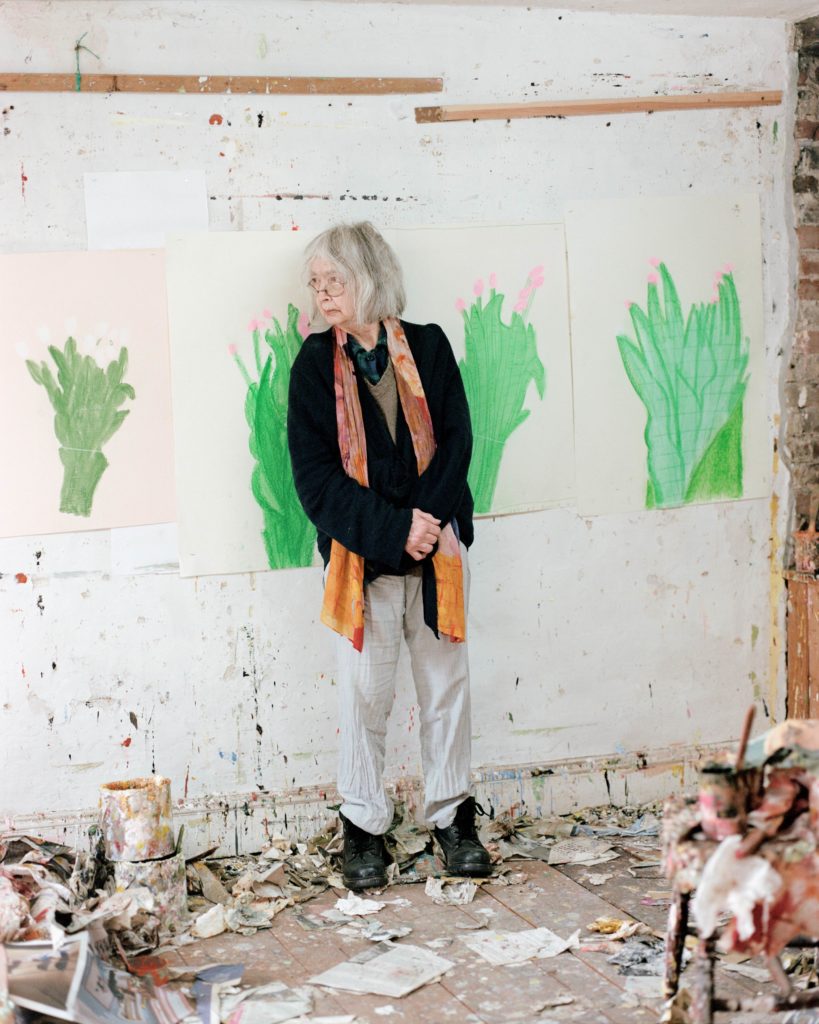
DK: Okay. Now these drawings of flowers[2] — they’re exquisite.
RW: My drawings are drawings for themselves. They’re not drawings for a purpose. All of them are drawings in themselves, which I then can use and so they become a purpose. But they’re not done as a purpose. The drawings are hugely important. The drawing comes before the painting. And then I make the painting from the drawing.
DK: So in a way, you have a very classic process.
RW: I’m quite traditional. I acknowledge it, but I’m also doing something else, which I hope comes through.
DK: Because of the scale of some of the paintings and their layered, constructed nature, it further lends the drawings an almost fragile quality.
RW: You get a jump between drawing and painting. I like contrast. And also if you tip [a drawing] the colors change. You know primroses in the evening light? They get lighter because it’s getting darker, a sort of iridescent pale yellow, but it’s difficult to get that. There’s another flower called King Alfred. It’s got a great big trumpet, and it’s quite coarse, and it’s big. It has a kind of vulgarity, but people do like it. Vulgarity is critical splendor.
DK: But does your vulgar radar change once you’ve worked with the subject? Does it become less vulgar? Does it become somehow accommodated and therefore redeemed? Is there work done in assimilating all of these things that are in your view ugly, destructive, or violent?
RW: I think in a way, I have a bit taken away from it because of the way I treat it. So it goes into metaphysical painting. Obviously with the severed arm and the blood and stuff,[3] the violence is there. But the way it is treated in the painting, since it’s not a copy, it allows you to see the violence and yet not shudder. If you look at the Beheading of Saint John the Baptist by Giovanni di Paolo, it is just a marvelous painting. The scene is ghastly. You can see the neck where it’s cut — it’s horrific, but it’s a marvelous painting. Now what’s going on there? That’s what I call transformation. And in the same way, I’m not repeating the violence so people can recognize it. I’m putting it into another register, I hope.
DK: Which is also perhaps part of the work of allowing unalike things to mean things together.
RW: One can enhance the other, and in fact, enlighten or intensify.
DK: Obviously language is also very important to you because you process a lot of things through language.
RW: When I write, I write like I talk. I don’t like art speak. I’m running a great risk because people think because I’m using this group of words instead of art speak, they think I don’t know this art world.
DK: Well, I think it’s harder in a way because you’re actually making it accessible as well. I see a relationship between choosing how to speak, speaking plainly, and the painting.
RW: It’s exactly the same.
DK: And I think that is political because it is a decision to make the language available.
RW: But it’s risky as well…
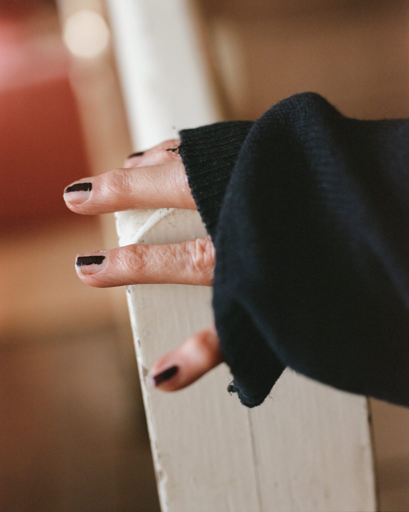
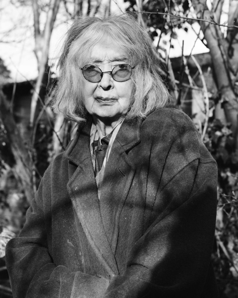
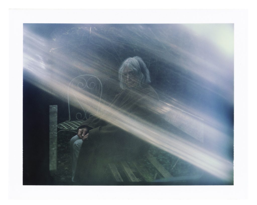
Artist: Rose Wylie
Photographer: Zora Sicher
Creative Direction: Alessio Avventuroso
Location: Artist’s studio, Faversham
[1] Barthes, Roland. 1980. Camera Lucida: Reflections on Photography. Translated by Richard Howard. New York: Hill And Wang.
[2] Looking at Crown Imperial, Yellow Daffodil, Pheasant Eye, King Alfred, all 2015, pp.80– 81, RA Catalogue
[3] Referring to Kill Bill, 2006, on page 90 of the RA catalogue.