Robin Clark: Let’s start by talking about a critical shift in your work, a transition from the gestural, textured paintings that you were making in the late 1950s to the parallel line and dot paintings you made in the early 1960s. I remember your telling me that you were moving away from an appearance of imagery in order to focus on visual perception. Could you explain that a bit more?
Robert Irwin: A way to think about it is as a kind of phenomenological reduction. I was most interested in energy as a perceptual property. I realized that a lot of what was going on in my paintings I was not really in control of. Part of the reason I felt they were out of control was the big format. So to focus my attention I started doing small paintings. In a way they grew out of a rare opportunity I had to see raku ware — raku was a real revelation because it takes you all the way down in scale to the point where the thumbprint has real power.
RC: How did this inform your work?
RI: I had an epiphany that maybe a straight line had the least potential for any imagery. So I started using line in a group of paintings, and in the process of doing them I got better and better with less and less. In the early line paintings, which had four lines generally, a couple of lines would be darker or lighter so that they still acted compositionally, and you could become aware of a kind of pictorial read of the thing still. So I painted a couple of paintings with just two lines. I thought it was really quite interesting, how using the exact same means, but a change from four lines to two lines, changed the whole focus of how one looks at something. I talk about it now as the idea of holding up a red square for students and they stare for twenty seconds and you take it away and there is a bright green square. The bright green square is unfettered, true perception only. Of course the green square is not even there; you are actually looking at your own perceptual process. You have to look at the two-line paintings like the “green flash” [that sometimes appears on the horizon when the sun sets over the ocean] — your eye becomes suspended, looking from one line to the other, but you can’t compose them. You are being forced to deal with the whole thing as an overall phenomenon.
RC: How were you thinking about your work at that point?
RI: I went to New York for the first time, because I thought there might be some kind of kinship with Don Judd and others. And basically the conversation that I got was confrontation. They were smart, much smarter than I was, and they just kicked my ass. It was a good lesson. I realized that my level of naiveté was not acceptable. So I started reading, I kept notes, I would write down what Hegel said, and I would write down my observations. It was a fairly laborious process.
RC: Getting back to perception in the paintings…
RI: The question becomes, can I make a painting without a mark? That matured into the idea of the dot paintings. I had the idea to curve the canvas very slightly, in every direction. Once the dots were applied, they didn’t manifest themselves as marks, but as fields of energy. In the beginning it seems there’s nothing there. But then spend a moment looking at it, and there is. Then I realized that everything I was doing was bounded by a frame, and if you think about perception, limiting yourself to the frame is totally irrational. The other thing with the dot paintings is that you see their shadows on the wall. Which to me was an incredible clue, because it’s something that is at best fugitive from a conceptual point of view and therefore meaningless really, but in terms of how you see, is absolutely crucial.
RC: You’re talking about how in addition to being convex, because you’ve stretched the canvas across a frame that has a gentle forward curvature like a section of a sphere, the dot paintings also project out from the wall because they are mounted on armatures that are several inches deep.
RI: Yes, this emphasizes the shadow between the painting and the wall, which has always been there, but now suddenly it becomes clear. The next question becomes how would you paint a painting that doesn’t begin and end at the edge? And that brought me to the acrylic disc paintings. I made them circular because that was the most neutral form. They were meant to be shown in natural light, as was done recently in the installation for the Phenomenal exhibition, but at the time there was not that kind of natural light in museums, so I devised something with four lights, which is cumbersome, and which is a little misleading, because they can end up looking like Mickey Mouse ears.
RC: Last fall people who were interested in exploring your work could see your acrylic discs installed both ways — with the four artificial lights in the exhibition “It Happened at Pomona: Art at the Edge of Los Angeles” and under a skylight in the “Phenomenal” exhibition in San Diego.
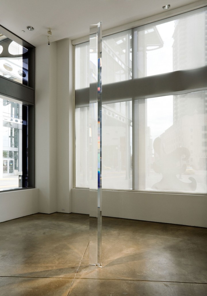
RI: The Pomona show was done very well; the key to lighting the disk that way is to try to get some of the circle to disappear, which it does really when the top and bottom are lit properly from a 45-degree angle. Oftentimes though it does not work well with that kind of lighting. I don’t want it to be done wrong, but I couldn’t run around hanging them for people. I was way more focused on the questions that grew out of the work. I started working on the acrylic columns because for a moment I thought this limitation could be solved by a third dimension. But it can’t be solved with a third dimension, because an object, like a painting, is structured.

RC: Your acrylic columns are completely informed by the space that they’re in, and they also very much effect the space that they’re in. This is a technical question, but since the “disappearance” that happens with works like your acrylic columns has partly to do with their pristine surfaces, what is the best thing to do when a piece chips or discolors?
RI: You re-polish it.
RC: Do you have any hesitation about not preserving it as an object made at a certain moment? Re-polishing means removing the original surface.
RI: I don’t, personally. It’s kind of like going around hanging things — I have way too much to do. Not that it’s not a real question, but it’s not something I will engage myself with. In terms of making the columns, I work with a guy named Jack Brogan, and if anybody wants to ask questions about preservation, he’s the guy to ask. In terms of process, the way that I painted the plastic discs was to put them on a lazy susan, which I then rotated while spraying paint from a distance. I was far enough away so that the paint was just drying as it hit the disc, so after many coats, the surface developed a tactile quality. Not shiny, but grainy so that the surface was less obvious, and very subtly colored. To get back to what I was saying about phenomenological reduction — I had to abandon the studio somehow. That’s part two.
RC: Well, maybe this is a way to get there. I wanted to talk about your work with scrim and the way that you’re sculpting space with light with this translucent material.
RI: It’s like the fence at the UCSD campus (Two Running Violet V Forms, 1983). At the distance from which you see things outdoors, it works like a kind of scrim. It is a kind of security fence material meant for prisons, which has a smaller aperture than regular chain link, and a lock weave. So visually it can act like a scrim.
RC: What is even more surprising is that you interwove the fence with a colored plastic, and the two together manage to have a shimmering quality, not what one would expect from metal and plastic at all.
RI: Yes, but you are seeing it from a distance, which produces a haze.
RC: Let’s talk about a major work that really did masterfully utilize scrim: your two-part installation commissioned for the Dia Center in New York, 1998-2000. The piece took up the entire third floor of the Dia Center and used translucent scrim to divide the space into eighteen chambers. How did that work?
RI: It was all defined by scrim walls, and each one had fixtures wrapped in theater gels with a slight difference in coloration. When you walk out of the piece you can’t hold it in your mind; you have to go back in so there is the experience of an immediate immersion. But what fascinated me the most was the idea of a nonhierarchical structure. You could begin anywhere and you could navigate the space in any direction. There is no order — at every point there are three or four decisions you can make. For me that was a breakthrough. I am going to do it again at Dia: Beacon. There the piece will float in the middle of the gallery, rather than occupying the entire floor, so you will be able to enter it from all sides. In that sense it will be even better, and less hierarchical than the first piece, which did necessarily have an entrance. I am working on the bulbs for the new piece now.
RC: How long have you been working with fluorescent tubes and colored gel?
RI: I’ve used gels as far back as the Dia piece, and one earlier. They did make colored fluorescents in a limited way, one red, one green, one blue and so on (they don’t make them anymore). With gels, I have an infinite number of colors.
RC: Your newest fluorescent works each have four possibilities for display — can you explain that?
RI: One possibility is that the lights are all off. There are three other sequences that we might decide. I don’t know of any other work that does this really. Is it good or bad? In a way, if you just flip them back and forth it is totally counterproductive, like being in the circus or something, very theatrical. In a way you almost have to have it in a room with you, watch it all day long, going through all the changes. What also turned out to be funny is that you would think that the light pieces look best in a dark room, but they work better in daylight. I can tell almost immediately if people are seeing it or not. I can tell by their posture whether they see the interactions and the subtleties.

