In 1994, Maurizio Cattelan was featured on the cover of Flash Art for the first time. This was followed by eleven subsequent covers, more than any other artist in the history of the magazine. Marco Senaldi analyses the strategic proliferation and canny mediation of Cattelan’s bold imagery.
Strategies
I don’t think it’s an exaggeration to say that Maurizio Cattelan has always had a weakness for covers. From his debut in the pages of this magazine, to his cover portraits for L’Uomo Vogue, to the entire Toilet Paper venture, whose covers remain memorable, it seems to me that Cattelan has dedicated himself to this form of divulgation with a precision that is certainly not accidental, and is perhaps even a little suspicious.
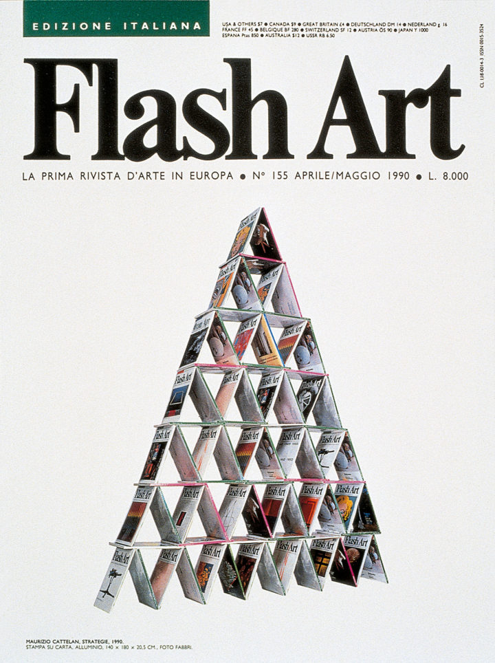
If I remember correctly, it was at a certain point around 1990, when I was working as an intern at Flash Art and Maurizio was insinuating himself with the editorial staff, that we started to hear talk of his having asked for a pallet-load of old copies of the magazine to use in an artwork. Indeed, it wasn’t long before we got wind of Strategies (1990), a pyramid of Flash Art issues deployed like so many playing cards — in short, a sculpture that stood as a declaration of intent (the future “strategy” upon which his work would be based) and at the same time a rather impassive metaphor for the art system, here compared to a house of cards.
But there’s a detail in this story that we shouldn’t neglect: I personally have never seen Strategies — that is, the sculptural work itself — because what actually gave it visibility was the fake Flash Art cover that Cattelan commissioned (apparently from the magazine’s own graphic designer, but I don’t know if that’s also a fabrication) featuring an image of his own work: a fake so perfect that it immediately started to circulate.
Now, at the time, there was a lot of criticism being directed at the art system (which in Italy was still in its early years) on the part of numerous artists, and, since Flash Art and art magazines in general were thought to not only belong to that system, but to uphold it structurally, various people were creating parodies or actual counterfeits of covers, invites, catalogues, posters, etc. (for example, Simon Linke — who was, incidentally, almost the same age as Cattelan — made an unforgettable series of paintings in imitation of gallery ads taken out in Artforum). Yet nobody understood that the title of Cattelan’s piece wasn’t merely ironic: his strategy was, effectively, to use that fake cover as a means of one day obtaining a real one.

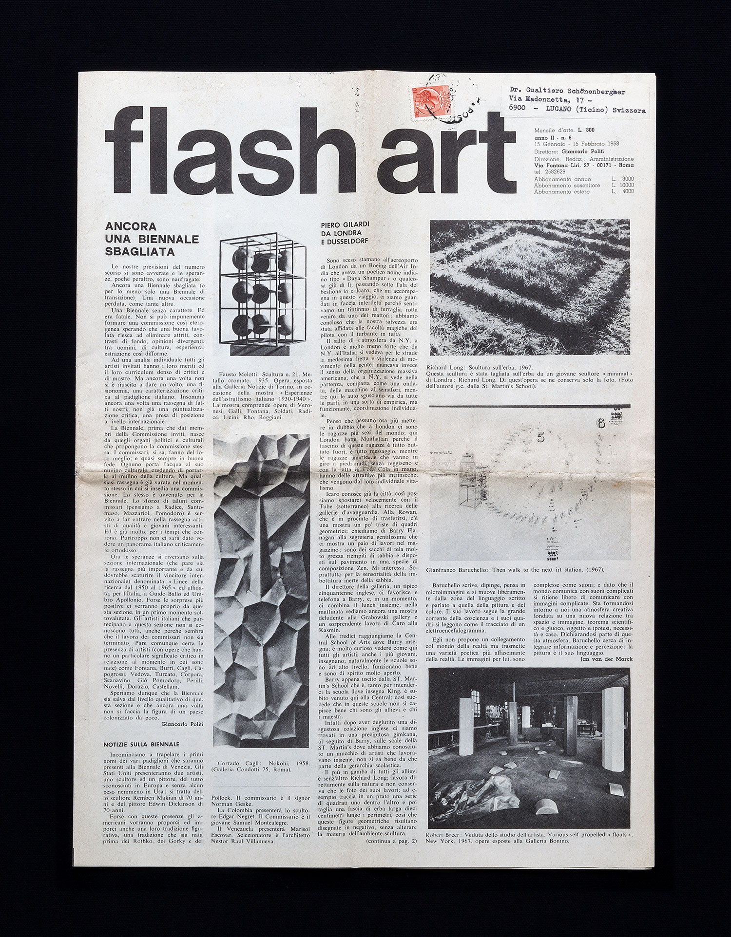
Flash Art Story
Of course, we might ask: Why Flash Art? And the answer would be simple: because the magazine was publishing some of the best art criticism in Italy; because its editorial staff was (relatively) accessible; and because its director, Giancarlo Politi, was a mythical figure in that strange universe. But maybe there’s another reason. Cattelan had grasped a simple truth that I myself, as critic and curator, had trouble seeing (or perhaps accepting): namely, the strategic function of magazine covers. Though this function may be less relevant today — in our era of online magazines, multiple covers for single issues, free press publications, and so on — in those years the privilege of a cover could secure substantial marketing leverage for the artist who obtained it. Cattelan, as an artist, had already intuited as much; but I, as a critic today, am able to offer a true analysis only in retrospect.
We would need to start from the fact that, at its inception, Flash Art didn’t have a proper cover; it looked more like a stapled, black-and-white fanzine than like the colored monthly it would become in the latter half of the 1970s. But even in later years, the magazine’s title and cover were simply markers of recognition and, if we look closely at Cattelan’s pyramid, we can catch a glimpse of one of Flash Art’s most popular issues, whose cover features a Warhol Marilyn (Flash Art Italia, no. 153, December 1989 – January 1990) — in other words, the magazine was using a historical icon as a teaser, in much the same way that newsweeklies were putting half-naked girls on their covers to accompany any topic whatsoever, from the oil crisis to the Italian Socialist Party.
But when I first stepped foot inside the editorial offices of via Farini 68 — which is more or less when Cattelan also started orbiting the premises — something crucial was taking place: the magazine had abandoned its stapled binding for a stitched one, at notable cost, and the cover image, in color and nicely laid out beneath the title logo, constituted a veritable statement of aims and objectives, as if to say: “Here, this is what’s new, this is the artist of the moment, buy me and you’ll be in the know too!”

So if, like good critics, we compare Flash Art covers published over the years, we notice a slight but persistent evolution that, in Cattelan’s case, is actually glaring. The first “official” cover secured by Cattelan, in Flash Art Italia, no. 182, March 1994, features the piece Ninnananna [lullaby], of that same year: canvas sacks of rubble from the car bombing of the Padiglione d’Arte Contemporanea in Milan; underneath the image there is a caption, with artist’s name and the title of the work, but this is followed by the names of all the other artists and articles that make up the issue. The cover of Flash Art Italia, no. 215, April – May 1999, however, is already different: under the image — which has since become rather famous — of the mime with the Picasso head and striped T-shirt (Untitled [Picasso], 1998), standing against a Pop art wall (maybe a Lichtenstein painting), the caption, “Cover image by Maurizio Cattelan,” emphasizes the name of the lucky chosen one, placing him at the top of the list of contents that follows. Ten years later, in Flash Art Italia, no. 247, August – September 2004, featuring once again a work by Cattelan — the infamous “hanged children” of Milan (Untitled, 2004) — the caption has disappeared and has been replaced by a simple, dominant “MAURIZIO CATTELAN” in all red caps. Finally, in 2012, on the occasion of his big retrospective at the Guggenheim in New York, there are actually five Cattelan covers for the same issue (Flash Art Italia, no. 299, February 2012), and the caption is reduced to a definitive “All Cattelan.”
This brief summary should suffice to convey the growing importance and crucial role of the magazine’s cover: much more than a simple jacket or illustration, that rectangular sheet of paper, multiplied by the thousands and displayed more or less everywhere, from museum bookshops to train station newsstands, was like an open-air exhibition space, a miniature, month-long solo show that was to be greatly coveted.
To take these musings a step further, I might say that the history of Flash Art covers intersects with the history of Italian art of the 1990s — the decade of contemporary art in our country, an unrepeatable era, like the ’60s were for cinema, the ’70s were for politics and the ’80s were for fashion. By faithfully recording the “climate of the times” (that is, the most innovative and interesting artists of the period) the magazine was helping to create it, launching figures while seeming to merely report on them, in that short-circuit between facts and descriptions of facts that constitutes the Mysterium Magnum of contemporary media. It seems to me that the mix of irony, disenchantment, Italian-style lampoonery and international glamour that characterizes the unique charm of Cattelan’s art was perfectly wedded to the mode of “detached engagement” adopted by Flash Art in those years — an attitude that still substantially coincides with the deepest spirit of Italian artistic poetics.

Cover Theory
But if that’s what Cattelan was to Flash Art, then what was Flash Art to Cattelan? I think that in terms of image management, Cattelan knew his way around. Even the most ferocious detractors of this national figure will in fairness recognize that, if nothing else, there’s one thing he knows how to do well, and that’s articulate the differences not only between the work and its image, but also between the image as such and the mediated image. Actually, I would go so far as to suggest that his work is intended to play on just those differences: as in the case of Strategies, whose end point was the fake Flash Art cover, in many other cases the work and its official photograph disappear or are viewable only with difficulty; but this merely fuels the proliferation of journalistic images that then propagate across all media. Few saw the sacks of PAC rubble, but their icon, launched by Flash Art, soon made the rounds of newsrooms; the same thing happened ten years later, even more virulently, with the children hung in Piazza XXIV Maggio in Milan (Untitled, 2004). In that case, moreover, the scandal provoked by the work itself was followed by the still more disturbing news of its attempted removal by a typical “concerned citizen” (who, among other things, hurt himself by accidentally falling off the tree from which the mannequins were hung). Now, everyone knows that Cattelan uses avatars of all kinds and that often he is not the one replying to an interviewer’s questions — but, whether his own words or not, his remarks in an interview from that period are significant:
First of all, I didn’t invade any private space, but acted in a public space. Furthermore, I didn’t do anything illegal, and nothing more inconvenient than many of the things that surround us and are already in everyone’s view. And I also found quite interesting that, for some reason, an image could not be accepted in real life but would be totally welcomed as long as it was reproduced in newspapers or on TV. That’s a pretty incredible fact.1
Ah yes, it’s a rather incredible fact, in the sense that it, literally, “is not credible.” How indeed can images of a work, itself insupportable, be deemed universally inoffensive? It is only by recognizing that (mediated) images of an artwork do not merely reproduce that work, but effectively engender a different “scopic regime.”2
Which is how certain mediated images of Cattelan’s works end up acquiring an almost entirely autonomous artistic meaning, like the picture of the three outstretched arms sticking out of a wall in Nazi salute (Ave Maria, 2007, cover of Flash Art Italia, no. 267, December 2007); or the photo of the table protruding from an external wall at the MMK in Frankfurt with a birthday cake on top of it (Untitled, 2007), which, however, is invisible to viewers from the outside and difficult to see from the inside; or the horse collapsed under the INRI sign (Untitled, 2009), which on the cover of Flash Art Italia, no. 278, October-November 2009, is placed against a white backdrop and therefore knowingly detached from the exhibition context.
The strange diffidence with which Cattelan has always regarded video as an expressive medium, and his evident discomfort with interviews, especially televisual ones (where he has always appeared only fleetingly, or via stand-in), can perhaps be explained in relation to this predilection for fixed images — to the extent that understanding many of his works might require us to rethink them as “three-dimensionalizations” of initially graphic or photographic intuitions. His passion for covers, which are emphatically static or, in their own way, extremely mobile, in the sense that they can appear simultaneously in many different places, derives from this.
It’s a passion typical of a “lateral,” oblique idea of art; after The Large Glass (1915–23), for example, Marcel Duchamp threw himself into making covers for the catalogues of friends like Man Ray, with an air of “not doing anything” (particularly striking is his avant la lettre Pop design for a Julian Levy show, from 1945). I don’t know if Cattelan knows this — I wouldn’t vouch for his naïveté — but I’ve recently discovered that the idea for his Fondazione Oblomov was rather similar to Duchamp’s project for an hospice des paresseux, a “lazy people’s home” from which anyone daring to work would be immediately expelled (Calvin Tomkins discusses this in his Afternoon Interviews, conducted in 1964).3
In this “pretending to do nothing,”* our catwalk of Flash Art covers draws to a serendipitous close. If we look at them one after another, they outline a clear “strategy,” like the turned-over cards in a game of blackjack: they’re not just a kind of “exhibition” stretched out across multiple decades, but end up resembling an actual “work.” One that, I would even say, is among his most accomplished.

