I should start out by stating that I have never been to Bruce Graham’s house. I hadn’t heard of it before being asked to write this text about it. I do not know much about Bruce Graham himself or really any specific history relative to his work at SOM.
The following text documents my only experience of Bruce Graham’s Chicago residence, mediated through images and drawings, which were themselves viewed through a sixteen-inch MacBook screen that sat atop a low coffee table in my Brooklyn apartment. I’d like to thank my partner Matthew Rosen for visiting the house with me.
OK. So, Bruce Graham? Bruce.
Modernist. The guy who did the Sears Tower.
Right.
And this was his private residence.
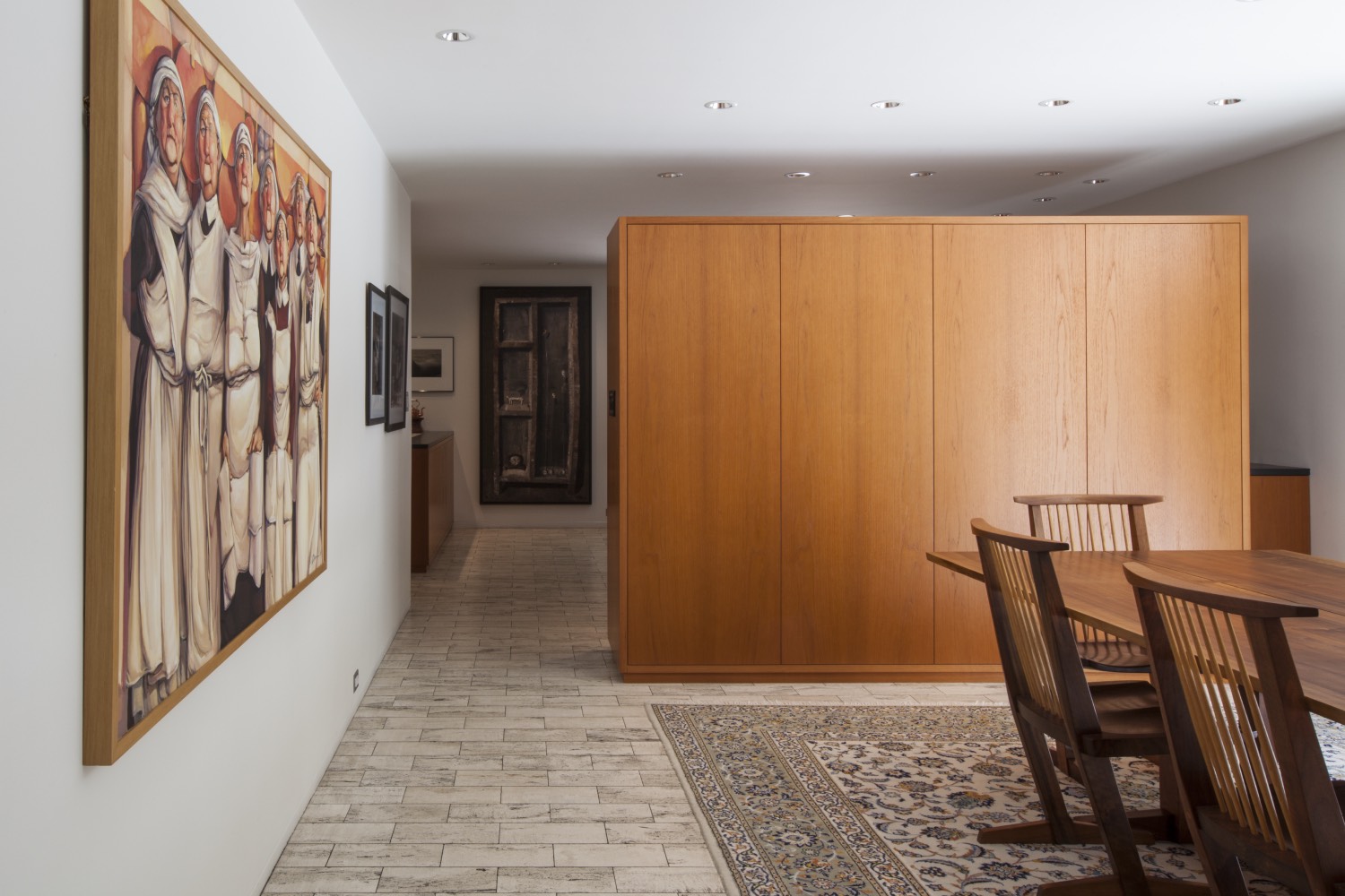
This is Nakashima. The furniture, right?
I know, I noticed that too.
And by the way, this is a renovation. This is not what it looked like when Bruce was living here.
I don’t think he put those overhead lights in. Those chrome lights are trash, huh?
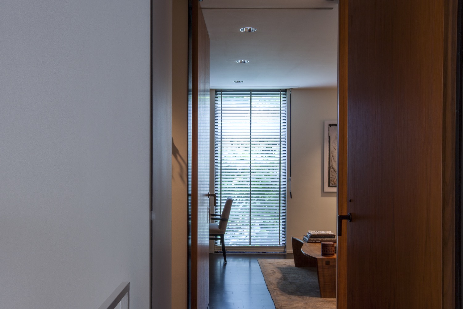
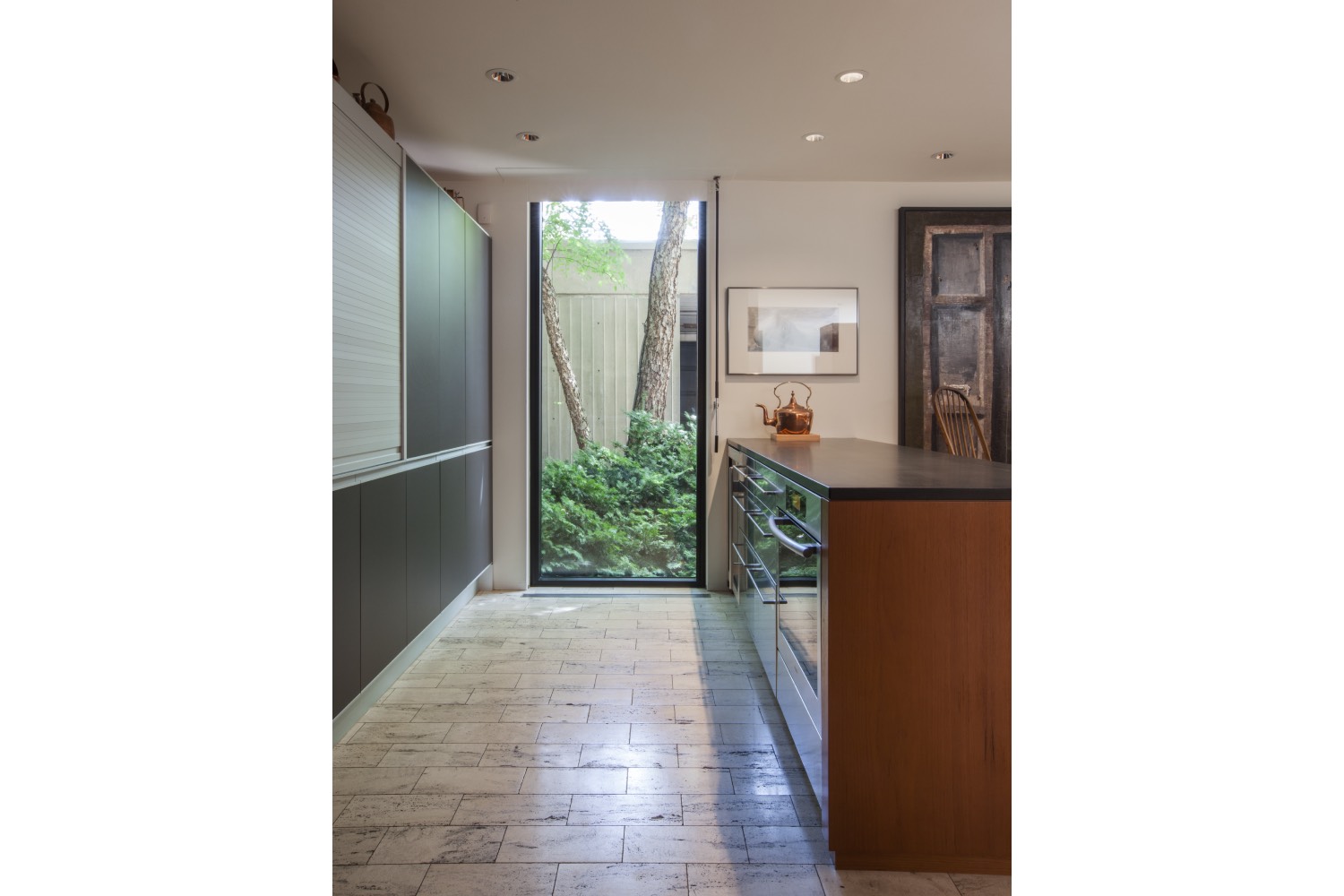
But I like the floor-to-ceiling window, it’s almost square in proportion. And there’s a lot of nice alignment and mirroring within the space.
I don’t really like the floor to be honest. I wonder if that’s original.
I think this furniture is original, his wife was an interior designer, maybe she designed these cabinet-like wooden objects in the space.
I never thought of him as being some kind of visionary architect, to be honest. I thought he was sort of one of these people who was surfing the modernist wave, you know, kind of keeping up with the prevailing aesthetics of the time. I think he’s doing a good job of executing on those ideas here though.
There are these resting moves, slab on wall, slab on wall.
Yes, the sonic thing.
Sonic thing? Tectonic thing.
Right.
You get these cut lines. Datum lines cutting across.
A lot of uninspired art in here though. Yea, some curators or art collectors moved in, part of the reno.
I’m not sure though. It’s pretty nice overall.
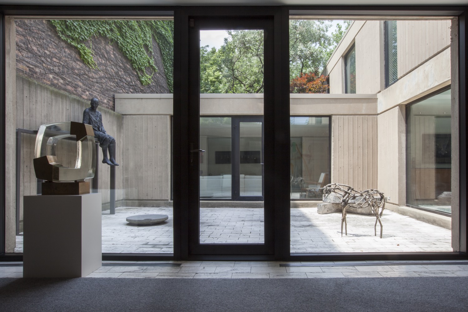
You see how only three walls of Bruce’s house create the courtyard, and the fourth wall is the neighbors? Like leaning on a friend, he’s using neighboring walls to create enclosure.
Dark-stained end grain on the stairs is nice. Yeah, don’t think that’s original.
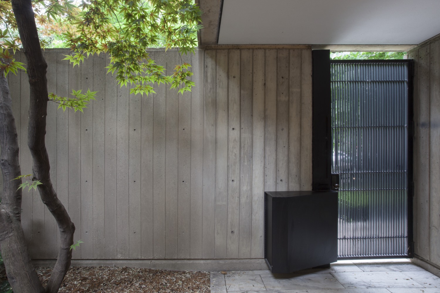
That entry thing is great. It’s like a big black volume by the door — maybe where the mail goes. The entrance to the street is very simple, clean, but the reverse side has this strange mass, like an appendage. An organ for the mail.
You know, in these photos you never get that one image which captures the totality of the place.
Maybe why it’s less notable, it’s hard to capture. The exterior isn’t iconic, the interior is nice, but no photo really gets at what the space must feel like. There’s a sense that there is a uniformity in the spaces. The interior seems to be around eight or nine feet tall, which is intimate, if not confining in its consistency, but the courtyard is acting as sort of relief from that.
Apparently, Bruce didn’t see a building over ten stories until he was an adult, having grown up in Columbia and Puerto Rico. Maybe the intimacy of space comes from that experience — the sky in the courtyards give you height but the interior spaces are quite low.
But then you look at what he’s known for — giant towers. He’s used to working at large urban scales. Maybe that’s where the uniformity of the spaces come from? This mentality of creating a language, a system, and sticking to it. Just as you might have a system of parts for the typical office tower. There’s some kind of corporate economy at play here.
These photos do not capture the entirety of the interior. When you look at the aerial views, it’s quite a large building with multiple courtyards. It feels like these images don’t capture much. I have to imagine everything I don’t see. I’m curious to know what’s really there. I wish there were more views.
Look at this tiny fence around the perimeter of the street-side garden. I looked up some older images — apparently that little fence was not there before. It must have felt a bit more open, like the space was being given back to the street. The neighboring buildings seem to claim that space for themselves, fencing it in in some way. It’s nice how Bruce pushed back on that in the original design, it feels generous to give that space back — let the neighbor’s kid play in your garden.
Yeah, wild how you can build something and think that’s how it’s going to be forever. But then, of course, things change. New owners, renovations, landscape changes, weathering, etc. All those details get changed and in turn change the attitude of the house, I think. Like this little fence around the garden. It feels more like a suburban office building now, whereas before it didn’t.
Crazy what a small little fence can do.
Yeah, it’s much more domestic without it.
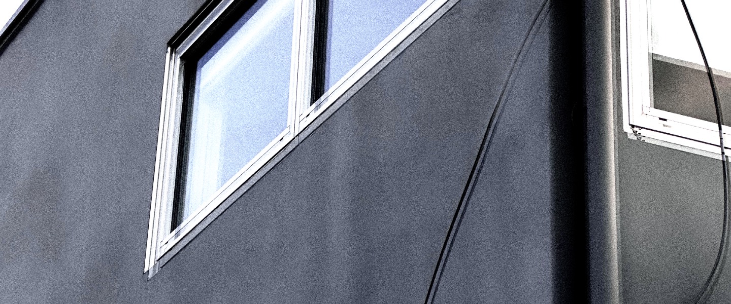
The facade is pretty humble. Which is very much in contrast to the giant towers that he designed. Those towers stood out, main characters in the skyline, but this house is smaller than its surrounding buildings, you might even pass by and not see it.
Totally — opposite in its transparency too, right? The iconic glass curtain wall tower, total transparency, then this almost entirely opaque facade.
For the late ’60s, very out of scale with typical domesticity. Those large windows feel like they were stolen from the construction site of some bigger building.
Overall, though? It’s not such a shocking design. It’s fine. It’s nice, and I think there’s kind of something interesting about that, right? That it’s not particularly dramatic?
I don’t think this house was supposed to be a flex. It’s not supposed to be a sort of show of ability or anything.
It’s really just a house, a well-executed house.
It does feel constrained though. The floor-to-ceiling windows and doors kind of shrink the already low ceiling height. It’s a matter of proportion for me.
When you look at the length of it, and you look at the general scale of the courtyard and the scale of the interior spaces, it feels small. Every space feels small. But the house as a volume, and the site itself, feel big.
Something’s off.
Maybe he was used to working at larger scales and couldn’t translate his thinking to such a domestic site and program like this?
There’s something so generic about sticking with that eight-foot ceiling, a sort of ubiquity that an office space has too.
There’s not much of a spatial hierarchy here. Feels very consistent.
All the rooms feel like they’re generally the same size because of the floor-to-ceiling height. They’re all the same sort of proportionality. There are some material shifts, but it’s really not that different. All of these images feel like they could be of the same room.
Totally.
And I think that that sort of consistency is something that was probably very sought after in office towers in the ’60s, economy of scale and so on. But in a house, there’s less of a need for that. A house like this has so much potential to create variation — to create difference rather than this sort of flat ubiquity. It’s like that thing in typography where if you place every letterform on a grid and you keep it all dimensioned equally — basically if you stick to geometric rules — it looks awkward. So, you have to break the geometry in order for the letter to be legible. Or in music when you program a drum machine to be mathematically perfect, it doesn’t feel like it has any swing or any soul; you need it to be just a bit late to feel right. The eight-foot datum is like that here. The rule is always followed, and because of that all the spaces feel the same, and they feel a little generic, and they feel a little tight, and there’s no moment where you feel like the system isn’t in control. No moment where you can get outside of the system.
I could imagine that if you’re walking through these spaces, that the courtyards give you a sense of openness, they break the system.
I know, I know, I’m saying that there’s something about the layout of this space itself which produces consistency. Even in the courtyard it almost acts as an atrium to bring in light and to create the illusion of exteriority rather than being a space to occupy. It doesn’t feel like a space that I would actually want to spend too much time in.
I think it partly has to do with the fact that the courtyards are so barren. There are no trees or plants within the courtyards. It feels a bit like that sunken space at the Beinecke Library that Gordon Bunshaft built — the one with the marble Noguchi sculpture up in New Haven.
Yeah. Somehow not a place to be.
It’s a light well for sculpture.
It’s a vitrine.
Yes.
You know what I mean? Yeah.
There are a lot of nice moves in this house. They fall just shy of really living up to their potential though. In part because of the proportionality, and I think in part because of the consistency. If there was more variation, more flexibility around the proportioning system, I think it would produce much better outcomes with the same gestures.
The gestures and the construction are interesting. The language is nice. But where does he break the rules of his own system? That’s what I keep looking for.
Maybe it’s the photos?
I think the photos are more flattering to the spaces than seeing them in reality would be. The angle is lower than eye-height. The photos are trying to make the spaces seem taller. You see how in some of the photos the countertops are barely visible? That means the camera is at three feet, not five feet which would be eye level. I’m sure the photos are making it feel more generous than it really is.
For sure.
It’s probably a pretty tight space.
Yes.
But I do really like the way it’s constructed. The tectonic, brutalist system. The courtyards and so on. Nice ingredients.
It does feel like it was made by someone who’s used to working with hundreds of thousands of square feet, and big gestures. And then suddenly everything scales down. From five thousand to five hundred square foot rooms, that’s hard.
If this house was a song, it would be one note — aaaaaaaaaaaa. You know? Consistent.
Speaking of that, he has this quote about sound and music. “Let me describe the difference between my idea of architecture and a lot of other architects. Number one, architecture is not painting or sculpture. Architecture is much more like music, which has an element of time. Architecture is about space and movement. It’s four-dimensional.” I appreciate him linking architecture to time, seeing it as something that changes as you move through. Rather than seeing it as an object.
Yeah. But unlike a song, which has a linear sequence, architecture has a nonlinear sequence. You can walk in one way, backwards, turn around. And so, in that way it is much more like sculpture in my view than it is like music.
I think it’s a nice statement. I think it’s true in a way that there is this dimension of time in all things that people don’t acknowledge explicitly enough. We’re temporal beings. We exist in time.
Yeah. It’s impossible to extricate yourself from temporal experience, but in the same way that you experience a building in time, you experience a painting in time. You don’t experience paintings and sculptures outside of time.
Yeah.
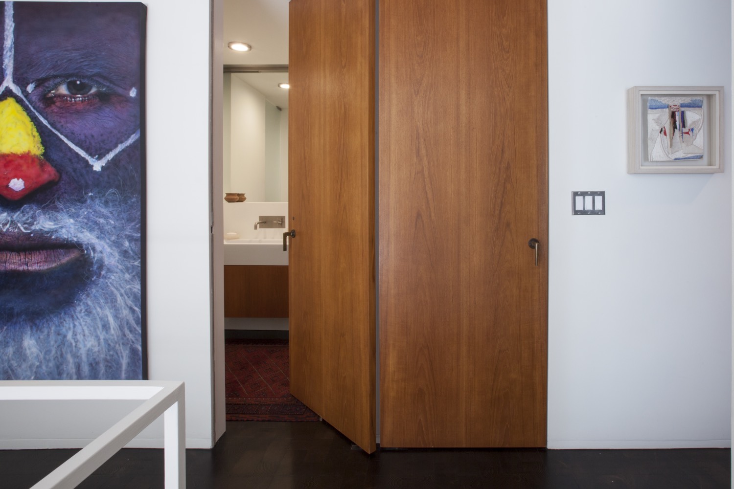
I think what excites me is stuff like this twin door — there’s perfect symmetry. And the fact that the pivot hinge allows the door to hide the edge of the wall, and the fact that the door handles are vertical and symmetrical, and the grain of the wood — so thoughtful.
I appreciate that kind of detail. And look at that entrance, the fact that there is a barrier between outside and inside, but that threshold is not interiorized. You walk from the street, open the front door, and you are still outside.
Yes. And the fact that you can look through the front door is almost playful. Because who would? It would require you to walk up to the house, which is already set back from the street.
I think it’s also difficult to judge this place because we’re so oversaturated with images to compare this to.
I know.
And those images are more compelling than these, somehow.
This house somehow defies imaging. It’s not made to be imaged.
Whereas nowadays everyone designs their buildings to the image. They work through imaging. They design through the render, then they build it and photograph the space from the same angle they set the render up from. It’s like set design.
So, you make a render to sell an idea, which you then turn into architecture, and then you photograph that building as a proof of concept for the idea you were selling in the first place. The whole thing is a marketing scheme. And this house was created before all that. And so, to experience it through our contemporary image culture, in the context of product photography and glossy Instagram feeds, it feels like the experience just can’t compete.
The images of this house can’t compete with images of houses that were designed to be experienced through imagery.
Yeah.

