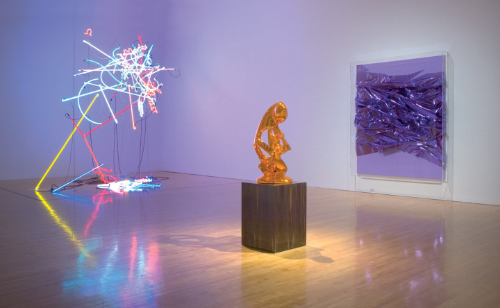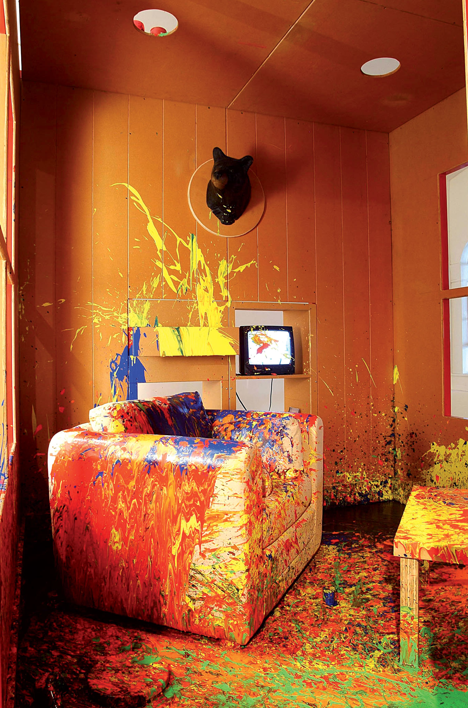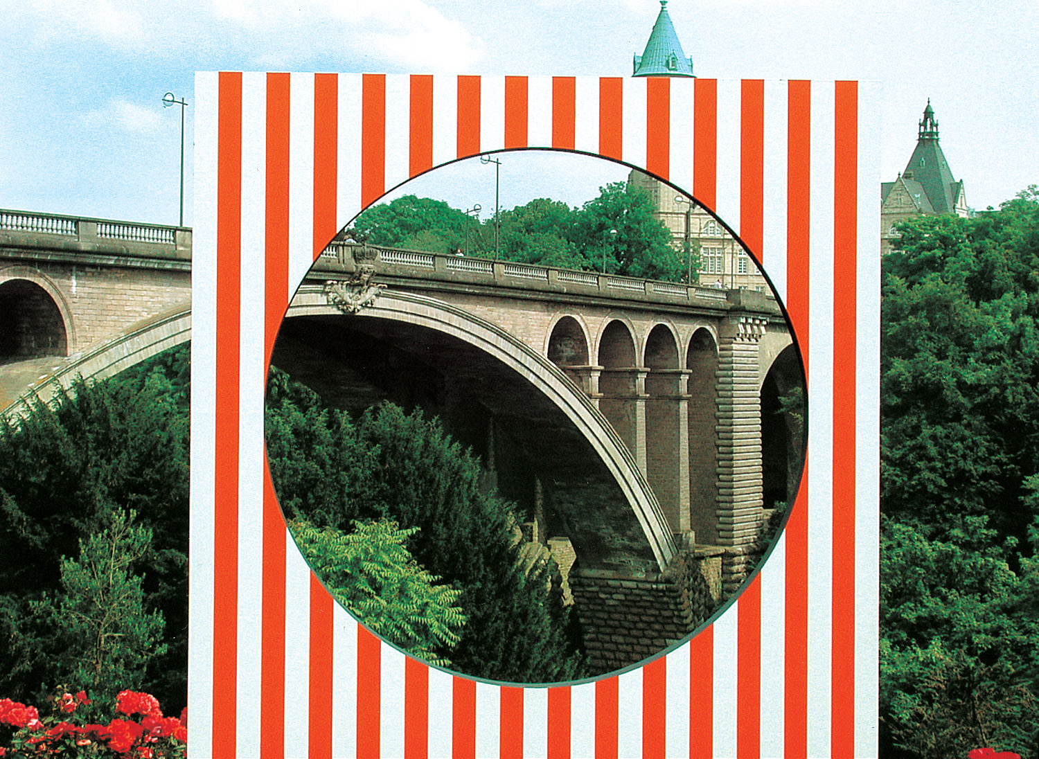
Anselm Reyle picks up the languages of modern abstraction like objets trouvés. He draws purposefully on the last century’s fund of genres, thus reintroducing movements as dissimilar, or even contrary to each other as Informel, Op art, Hard Edge or Minimal, and making them disturbingly simultaneous. In terms of style he produces a characteristic aesthetic climate, creating a dense mixture of affirmation, distance and intensity that goes beyond the individual work. Presenting vagueness in this way makes heterogeneous styles compatible, looking so surprisingly comfortable in these juxtapositions that despite historical discrepancies they are still capable of being disturbing: anyone visiting a Reyle solo exhibition without knowing the work too well beforehand could easily gain an indeterminate impression that this is a group ‘modern art’ show.
Reyle presents his work like this firmly, but unobtrusively. And he also counters the presentation with colorfully assimilated quotations of reality, bringing in agricultural equipment like haycarts and fruit presses painted in neon shades as well, or showing lamps lit in color and wall cladding with monochrome illumination. Reyle exploits this kind of friction between different art and design languages and alienated everyday objects with great subtlety. But he is not just concerned with removing the magic from once-noble abstraction to make it a set of specimens for the present, not with postmodern ironic distance, and definitely not with reviving past formats. Reyle is pursuing an interesting third way by taking the pictorial languages he brings to the surface seriously, both assimilating and alienating them at the same time in reflection. When he revitalizes the rapid, free-standing gesture of an artist like Karl Otto Götz in shades of purple, red or green, and with neon colors, or when he invokes abstract stripe paintings in extreme color schemes, then this is just as much an assertion as a quotation, and so it is indeed possible, to quote the Berlin critic Knut Ebeling, to “find it liberating” when an artist “defines painting as a complete construct — and yet is able to believe in it.”1 Reyle is trying to do something similar, and in his formalization of second aesthetic assessments he has developed a style that is entirely his own, and not just in painting.
Jens Asthoff: In the ’80s and early ’90s artists became increasingly interested in appropriating historical styles. Do you see this as something close to your recourse to the pictorial forms of modernism?
Anselm Reyle: I think that I am interested in it from a quite different point of view. I don’t just want to take something up and present it as an available form. I deal with it more like objets trouvés that I come across because they fascinate me and then I intensify this fascination, and so want to show it. And I’m partly interested in styles as well because they are so well-worn, as in the case of the stripe paintings. It’s such a simple principle, every art student must have used it at some time. And you’re usually told that it’s over and done with, that it was around in the ’60s and wasn’t even new then. And in the ’90s stripe paintings were taken up again, ironically, by people like Heimo Zobernig. But the irony isn’t the only thing I find interesting about it.
JA: When you appropriate things like this you exploit the quality of materials and color thoroughly, aiming at effect and alienating these traditional paradigms by raising the overall color temperature. You shift the adaptive element, the reference that can still be recognized or at least sensed, into a mixture of vagueness, emptiness and intensity. This leads to a quite specific, unique smoothness and neutrality that in its turn takes on the character of a personal style, your style.
AR: Yes, I am interested in a certain neutrality, on the one hand, but it has to be opened up and charged subjectively as well. I don’t see what I am doing as cold Neo-Geo art.

JA: Can you be more precise about this relationship between neutrality and subjectivity?
AR: I operate intuitively. But working with assistants, for example, is good for that: I find this kind of working situation suits my approach. I have more time to make decisions, and it is also easier for me to make decisions. If I decide that a picture has to be done again, I don’t immediately see myself faced with a whole heap of work. This works best with the stripe paintings. Of course I decide what colors should be used, but beyond that all I do is add a few dabs of paint at the end or change one color. Here subjectivity is invested less in doing and more in deciding, which makes a completely different flow possible in the work overall. It also makes a difference to the position that’s taken up if there are only three stripe paintings or thirty or perhaps fifty. And then I am also fascinated by the abundant color, the variety of combinations. It is possible to paint a dark, depressive stripe picture, but also a bright, airy, summery one. Once you’ve done a picture, you perhaps have the next three in your head straight away. I only have opportunities like this if I am working with assistants. This too helps to create the special relationship between neutrality and subjectivity.
JA: But is that not different when dealing with free gestures? Surely you can’t plan that in the same way? Besides, I have the impression that to a certain extent you are pushing more individually against composition here, that you are interested in the question: From what point is something a picture, at what point does it dip over into being undefined? Is that something about pictures that attracts you?
AR: Composition is something I find questionable in terms of traditional abstraction. One is exploring the latitude afforded by the picture space, and then acting quite traditionally in terms of composition, and looking carefully to see whether a line is now ten centimeters further to the right or left. That can sometimes look quite pernickety, and I think ultimately it’s a matter of what you’re used to. I’ve always liked the element of simplicity in positions like that of Karl Otto Götz for example, the question of when a picture starts to be a picture: someone empties two pots of paint over a canvas, wipes over them three times, lets it dry and sells it to a museum. You can see it as simply as that. I want to reveal this simplicity. Squeezing out a tube of paint, going into it two or three times with the brush — that really fascinates me. And this might already be gone by the fifth line. I want to capture this moment, and at the same time show how questionable it is to assert that this is a picture. That wasn’t what artists like K.O. Götz were trying to do; on the contrary, he was trying to perfect it. While examining gestural abstraction for myself I have noticed how little I am interested if someone has got hooked on their own gestures. That is a standstill for me, a frozen gesture. I feel it’s dead. An artist like Götz was always pushing further and further into something like Zen Buddhist mastery, and it’s precisely that I want to get away from.
JA: You show an interesting tendency towards dissolving form. The special thrust of your work is often the fact that you test the limits of pictorial quality, empty the non-representational space, but at the same time make it extremely strong visually. This strong inclination towards surface has sometimes been misunderstood by critics as decorative or affirmative. But I see it as the consistent way in which you respond to form standing still, as you have just described in relation to Götz. You actually try to release the gesture, i.e., to strip out the compositional formulae. Concentrating on surface in this way then produces paintings that show how questionable such a view of gesture and composition actually is, while it still allows the paintings to participate, to maintain their validity as paintings through it, to assert a form and to throw up criteria. An interesting boundary runs here and you formulate it very deliberately, I think, and also push it a very long way.
AR: I am interested in precisely this ambivalence. I find it interesting to introduce this kind of vagueness, which still leaves a decision to be taken about form or formlessness.
JA: You recently had a big solo show in Zurich.2 Faced with the various series of works and style, I have once more seen your principle of working with objets trouvés: painting, sculpture, light, and direct adaptation of motifs by other artists as well, Fernand Léger for example, or borrowing the painting style of an artist like Otto Freundlich, and also alienated design and everyday objects — the whole heterogeneity of your pictorial world seems to come together here.
AR: Working with objets trouvés is very important to me. Actually even the stripe paintings can be called objets trouvés, something I perhaps once found in a catalogue or have in my head as a stereotyped memory of umpteen similar works. The sculptures are objets trouvés as well, or their form draws on objets trouvés. Or the material for the foil pictures: I originally discovered that in a shop window in Berlin. Of course the lamps are objets trouvés and I change them with colored light, sometimes pour paint over the lampshades, and the same applies to the vases or the wall claddings. Including objets trouvés like this is important as an extension of pure painting. I move into this limited space of abstract painting, but I then try to break it open, to extend it. Often with things that come from the outside, that I come across by chance. Materials, but also questions of style and taste as well, expressed in stereotyped pictorial forms.

JA: How do the neon installations fit in with this?
AR: They are objets trouvés or remnants. I once worked with glass-blowers who make these thin, colored neon tubes. There were leftover bits all round their workshop. I took them as they were and hung the pieces up in a space as abstract, free-floating light drawings. But in Zurich there were over a hundred individual parts in a space of their own. The light colors were able to work together here, there were subtler gradations, lots of different shades of red and green, harmonizing with each other or clashing. It no longer mattered what fits precisely, it was about the overall effect. It seemed light, but it looked very solid as well. Actually similar to the stripe paintings or the new Otto Freundlich pictures.
JA: The connection between light and color runs through all your work — the glowing, aggressive quality of neon colors and neon light, and also their artificiality. And you did actually call one of your exhibitions, in Aachen in 2004, “Light and Color.” Was that actually a quotation? It is the name of one of the Turner paintings stolen from the Schirn in Frankfurt in 1994.
AR: Yes, but I was most interested in the title because basically every second exhibition could be called that. To that extent the title was an objet trouvé as well, like “Ars Nova” in Zurich. It’s a brand name I found on a package for acrylic paints. My titles are almost always objets trouvés.
JA: You showed one of your new sculptures in Zurich as well…
AR: Yes, a big one in orange. There are nine copies of it in the small version and four large ones, all shiny chrome and in different colors. I am already working on a new one, this one here [showing a little soapstone sculpture]. I can imagine this one big; other formats can be better for small ones. It’s the kind of thing you find in flea markets or Christmas markets [laughs]. Seriously though, I find it interesting that applied art things like this often epitomize modern sculpture within them. You can see that in the enlarged form above all. In fact the model for the work shown in Zurich was a little souvenir of Africa, also carved in soapstone, that I found in my mother’s cupboard. I think the person who made it must have seen Henry Moore at some time. I am interested in identifying these modernist clichés in strange contexts.
JA: Are you interested in reconstructing an epitome of modern art? In appropriating a style in order to take possession of it differently?
AR: I would say: Taking a stereotype in order to breathe new life into it.
JA: Though the cliché always remains visible?
AR: Definitely. Someone once said that my art always looks a bit like a film set, as if someone’s saying we need a bit of modern art in the background now. I liked that, and it’s right that it is usually the cliché of something that interests me.
JA: How do you try to work against this cliché?
AR: I don’t see anything bad about terms like cliché, effect, etc., that have negative connotations. Ultimately it’s not a cliché, it’s something a lot of people have agreed on. I try to get to the heart of it.
JA: To intensify it?
AR: Yes. For example, to exaggerate it so much through the material that it really does start to move people again, that it’s not just a well-worn cliché, a stereotype. To transform it into something that makes sense in a new way.

