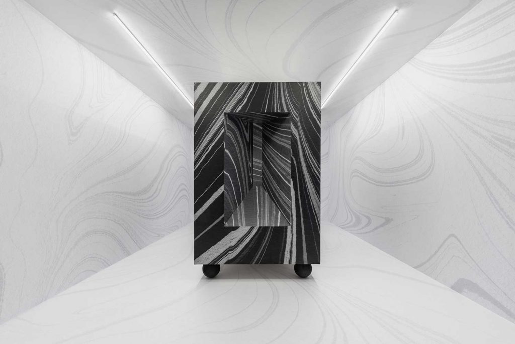
In the beginning there was a telephone. And this telephone was ringing. And no one was answering. As there was no one in the room. (But — wait a second — why is there a telephone? Is it supposed to be here? Might it be a trick or a sort of a virus, messing with the data and mixing everything up? Should we reboot, to make the ringing stop, and, in doing so, start all over?)
>Press ENTER to shut the telephone down and restart>>
In the beginning, there was neither a ringing sound nor a telephone (refutation of the initial premise completed). There was actually a room. Or an apartment. With windows and everything. And there should have been a house, too — if we keep adjusting our vision and perceive things more globally — and also a city. Yes, in the beginning, there would have been a container for the telephone. An architectural container, to be more precise. A context. Someone should have installed the telephone somewhere, before it could actually ring. By the way, the room was square or rectangular — naturally, it was neither a circle nor triangle, meaning no pantheon or pyramid. Since, to live in one of those, you should be more a god than an actual human being. Or at least pretty long dead. The room was not that big and pretty simple, with simple walls, maybe even white, maybe bright yellow or darkish blue. I guess it was a random New York apartment, nothing special — there are lots and lots of them that look pretty similar if we subtract all the furniture and personal memories.
Speaking of memories, even though the walls were usually smooth, it is quite possible that they could have been covered with a Roll-A-Tex texture: imagine that it’s almost the ’80s and you’ve just moved back to New York from, oh, I don’t know, New Orleans? And the texture of the walls that you have seen there, since you were living in a typical middle-class house, or maybe your friends were living in typical middle-class houses, or maybe day after day you were walking by typical middle-class houses: it still manages to haunt you. So you could have seen the walls in the New York apartment as those of your memories, with thick texture, which made them sort of vibrate if you kept looking. The room was meaning (to you) a lot — referring mostly to the idea of confinement since you had just moved in, had no established attachments yet. The room, this confinement, was thus at the beginning of all. Maybe some books as well — Foucault, Baudrillard, et al. — which, obviously, have spiced up the very idea of isolation. But, to tell the truth, the room gave off quite an ambiguous sensation: sometimes it felt like something positive, even vital, providing a moment of quiet, crucial if one wishes to hide and recharge oneself. In a cell capable of self-regeneration. But sometimes it felt like a prison, suffocating. So, even though there were no grids on the windows and there was a pretty nice view, the bars were there, invisible. Just as they were there on the windows of all the other apartment buildings. Isolated cells. But then, a telephone rang in the neighbor’s apartment. A toilet flushed. A light came on, leaking out of a window on the opposite side of the street. Everything was interconnected. By wires, by tubes. By L-shaped conduits.
>Press Y to continue>>
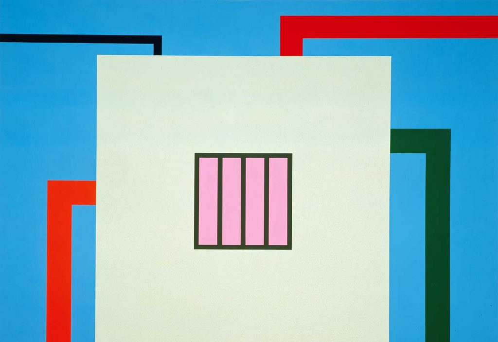
The telephone is not ringing. But the room is still there, even though it might as well be a different one. Is it really? Could you tell the difference if all the rooms are so much alike? Isolated one from another and/or interconnected by invisible channels of communication, they seem to be adding up, block by block, reproduced ad infinitum. As if they were all copies — permanent reflections? — of a model and the very model they repeat. Their presence, however, is quite a puzzle. No wonder that a “why” question necessarily pops up, entering into the equation. For a room to be, there should have been someone who would have first imagined it and then designed it, bringing a model — a geometric idea or a form — into a palpable three-dimensional existence. Sculpting its textured walls with care. So, before the telephone and its insistent ringing, before the room and its tactile interior, there should have been an architect. Or, if we are to speak of this architect metaphysically: the third of Aristotle’s four primary principles, an efficient cause.[1]
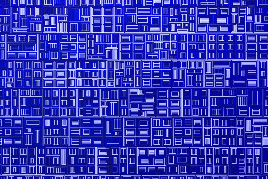
And then, there were the cartoonish drafts, the eighty sketches from the 1980s, which would remain mostly sketches even though at some point they would be monumentalized, switching media and passing from drawings to digitally reproducible prints. Goofing around, they obsessively explored a limited set of schemes: squares versus grids, that is to say, houses and cells versus prisons and prison windows; pyramids and angular spirals drawn below a horizon line, referring to hermetic tombs (but also to the capitalistic design of being) with their hidden mazes (or underground currents of the opposition); toilet lids and canalization systems versus explosions, alluding to infinite lines “piping in” reality and the information rushing through them at fast speed, respectively. Being too specific, too literal, not universal enough, these complex schemes were then transformed by means of an alchemical synthesis. As a result, three primary elements — a square, a grid, and a conduit — were obtained, thus gaining in power and speed. With the increase in their level of abstraction, they would rather function as symbols, capable of referring simultaneously to multiple realities, or as magical artifacts powerful enough to tie up micro- and macrocosm, just as they were able to tie up a room and a city, a part of a system and a system as it is, knowing that these elements were captured in a condensed, even compressed form of an ideogram or a flowchart. Then, using these three elements as building material, the construction work was begun. Thus the paintings appeared — bi-dimensional textured chambers or maps of cities as viewed from above. Repeating the same structure, they changed with each repetition, because the very context (the contemporary world they were trying to reflect) was changing all along. So, some serious modifications in their primary configurations were necessary. On the other hand, there are paintings in which the conduit element is absent (The Prison of History, 1981), and there are those, appearing in the 1990s (for example Web, 1995), in which the same element becomes almost ubiquitous, referencing the explosion of information at the beginning of the internet era. Resulting from the principle of repetition, paired with alteration, the paintings seemed to be building a sort of a maze, which is however logical, since it’s hardly possible to argue that the use of a repeated and slightly changing pattern is the only imaginable way to build a labyrinth.
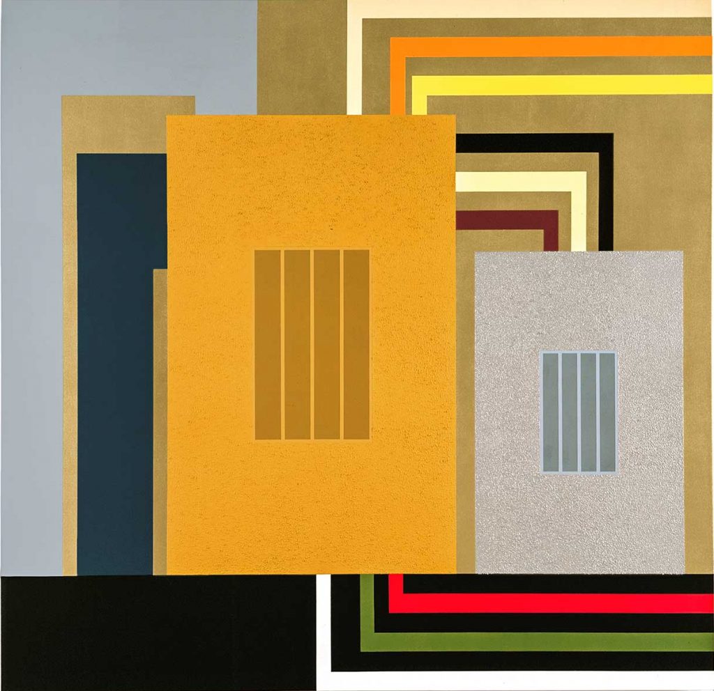
So, an artwork, both a sacred prison and a game — it couldn’t be otherwise, being that from the very beginning, a labyrinth was indeed both these things: a prison for a Minotaur and a survival game for those who were led to him to be part of some sacrificial ritual — this maze was slowly pushing itself into existence, building itself up, painting by painting. It multiplied the windows with grids and invisible doors and L-shaped hallways, not to mention the square halls or chambers, which, by the way, could remind you of Boccaccio’s dream of a geometric labyrinth shaped by a juxtaposition of squares and not by circling spirals, which others seemed to prefer at that time. Alongside, writings appeared — numerous essays about the inescapability of context (meaning the inescapability of labyrinthine reality?). Context would remain inescapable even for the allegedly auto-referential forms. Among the essays, one text in particular (Notes on the Paintings, 1982[2]) contained the key that could unlock each of the labyrinth’s chambers (the paintings), without, however, unlocking the center of the edifice, as it couldn’t be unlocked that easily, could it? After all, speaking of labyrinths, we don’t enter them hoping for a quick solution or a shortcut that would allow us to get to the meaning directly. In this case, it’s hardly even a maze, but rather a straightforward corridor, observable from its entrance and similar to a simple syllogism, in which a premise leads transparently to a conclusion without any additional sophistications or, if we are to speak of them in spatial terms, ambiguous changes in the trajectory. We enter the maze so that we can slowly explore its constantly changing structure and wander round and about. We stop at certain moments, feeling particularly lost, and take the time to put together the clues found along the way. In this sense, the labyrinth is not just about an algorithm or an unceasing repetition of a pattern. The labyrinth demands an attentive reading, because, like an oracle, it “neither utters nor hides its meaning, but shows it by a sign.”[3] The necessity of hermeneutic deciphering, which unfolds the arcane sense hidden inside the clues, is implied in its very conception.
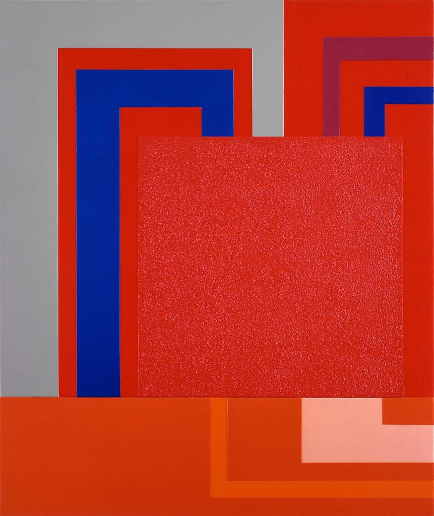
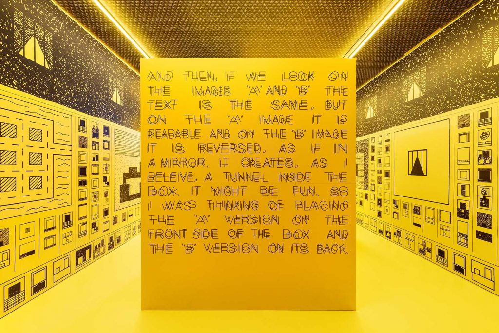
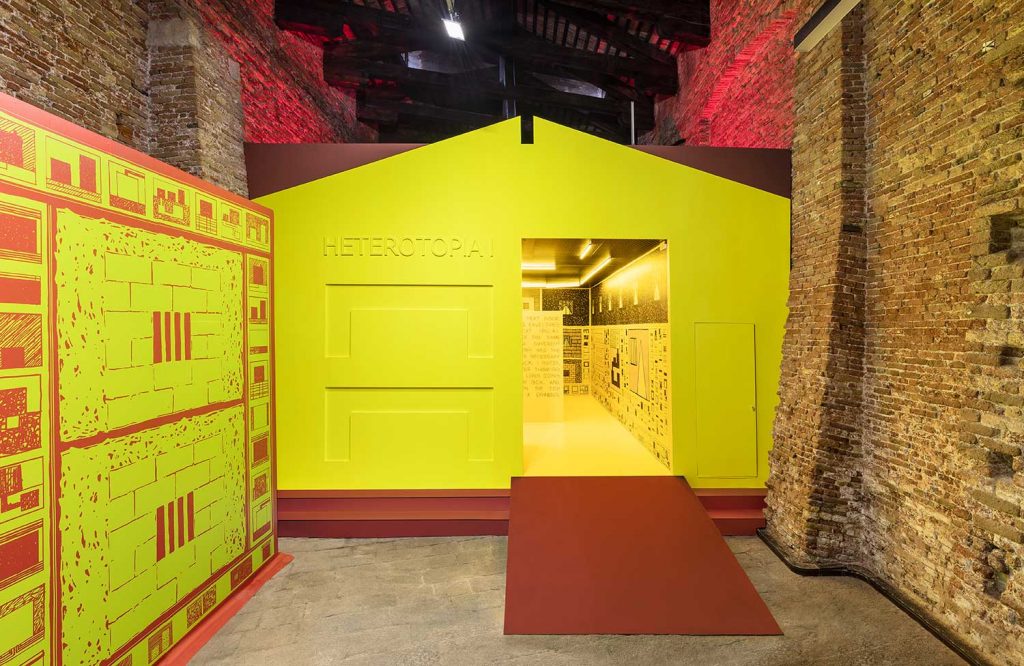
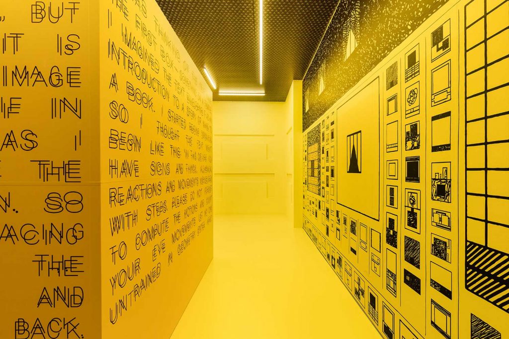
Then, the build-a-maze strategy developed through the creation of some mazy environments which envelope already existing spaces while (1) shifting their architectural properties up, as in Schirn Kunsthalle, with its circular two-folded structure and its wallpaper design conceived according to a principle of repetition, so that visitors moved in both architectural and informational circles; or (2) creating a context for the paintings by, for example, implanting them into an icy digital landscape, a silverfish skyline full of frozen fireworks or icebound explosions, as at Galerie Forsblom, Stockholm, in 2019; or (3) by doing these both things, like at Lever House, in 2018, an all-enveloping installation which, by creating intertwining codes and narratives, played with the ideas of reflection, allowing the surrounding context (meaning — the profile of such a modernist city as New York) to paradoxically fit inside an infinitely smaller space of its iconic building.
At last, we arrive at the point when we decide that this is actually not a maze, but a box. A random box. It’s not even unique since there are at least several rows of such boxes, looking quite similar. But — here is the trick — if, for a change, you dare to think inside the box and not ex contrario (knowing that the think-outside-the-box imperative is less an axiom than a conventional slogan), some walls will grow and puzzling intersections will appear. A maze at last? Perhaps, but also a prison and a temple.
Would you choose to enter?
>>Press ? key to load the game>
<<Press … to escape<

