The Bowery brings out a sentimental streak in New York. For decades the street was seen as a shady problem area, but since more and more of the catering shops and shabby bars have been forced out by luxurious condos and expensive restaurants, New York city guides and magazines have been enthusing with a mixture of horror and melancholy about the times when the Lower East Side rents and crime figures were proportionately the same but the other way round, and the legendary CBGB club was still full of decent punks.
Anyway, New York has a new museum at the junction of Prince Street and Bowery. It opened last December 1st and is called, simply and charmingly, The New Museum. Those who are in the know like to call it “The New New Museum,” which again sounds like a programmatic statement about doing everything differently. The architects and curators intended nothing less.
New York actually owes the fact that there is a new museum at all to the narrow-mindedness of its museum directors, who fired the curator Marcia Tucker from the Whitney Museum a good thirty years ago because they were not pleased with her take on art and especially not with her Richard Tuttle exhibition. Marcia Tucker did not allow herself to be intimidated, and opened her own museum exactly one day after her unceremonious dismissal from Tribeca. It became a successful channel for discoveries in the succeeding years, showing Richard Prince’s work, for example, as early as 1980. In 1999, Lisa Phillips Tucker, who also came from Whitney, took over as director and pushed the fifty million dollar new building project forward.
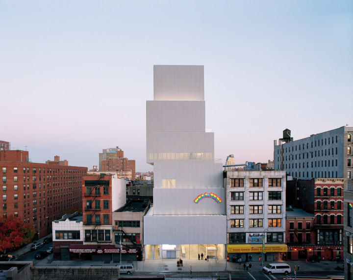
The contract went to the Japanese architects Kazuyo Sejima and Ryue Nishizawa, who together run the SANAA architecture practice in Tokyo. SANAA made a name for itself with sensational concept buildings that were then actually built, to many people’s astonishment. SANAA intends to take the ideas of inside and outside, public and private apart and reconstruct them in a new, softer arrangement. The Moriyama House established them as the experimental building philosophers of their generation. Sejima, who was born in 1956 and studied under Toyo Ito previously, and Nishizawa, who is ten years younger, have been running their joint office in Tokyo together since 1995. SANAA, who made their name internationally two years ago when they built the 21st Century Museum of Contemporary Art in Kanazawa, are also building the Zollverein School of Management and Design in Essen, Germany. This building is a seven-story exposed concrete cube — though there is no sense of separate floors. The square windows of different sizes look as though the architects had stamped them out of the fresh concrete with biscuit moulds. The windows become more concentrated nearer the bottom corner, where the façade looks like an unravelled concrete net that is breaking up and revealing a glazed body; the building becomes more solid towards the top, and windows appear only rarely. The public areas of the school are placed where the closed façade opens up and turns into a collection of window frames, and the more intimate ones are found where concrete is dominant — but that is also all the façade is giving away. The modern belief that the façade should reveal what is going on behind it because otherwise it is a dishonorable façade that should be rejected on moral grounds is thrown overboard: it is impossible to gain a sense of how many floors are concealed behind the envelope, which at night looks like a transgalactic diagram full of four-cornered stars.
In New York it is above all the façade that makes a striking impact: there are scarcely any windows to be seen, just a large, silver-gray shimmer and, according to the incidental light, the building looks gleaming white, a matt light gray or shining silver — all because of the coarse-mesh steel net that covers almost all the outer skin and also the windows, like a curtain. Inside this creates a slightly prison-like atmosphere in places, but on the other hand, thanks to the net façade (which is essential for insurance purposes, says SANAA architect Toshihiro Oki), the windows can be opened wide even at a height of twenty meters, letting the good New York ocean air into the office, rather than the usual identical air pumped in by air-conditioning units.

As well as this, the steel mesh net makes an interesting effect when seen from a distance: the completed building is reminiscent of a model in which no details such as windows have been taken into account.
The all-over gray of the façade reminds some people of the World Trade Center, though in theory the SANAA building is just the opposite of this. The Twin Towers were built around their elevators, and towered evenly into the air with a sense of desolate resolution, while the New Museum is piled up as if it were made of removal crates jumping madly to and fro — and it is the edges created by this jumping that makes the rooms above and below them so interesting: a roof terrace is created here, and there daylight falls on the art through a slit in the ceiling. What SANAA are giving their skyscraper is a really good dose of rock ‘n’ roll — and the swinging hips create narrow stairs, views through, wide spaces and niches of a kind that are not found elsewhere.
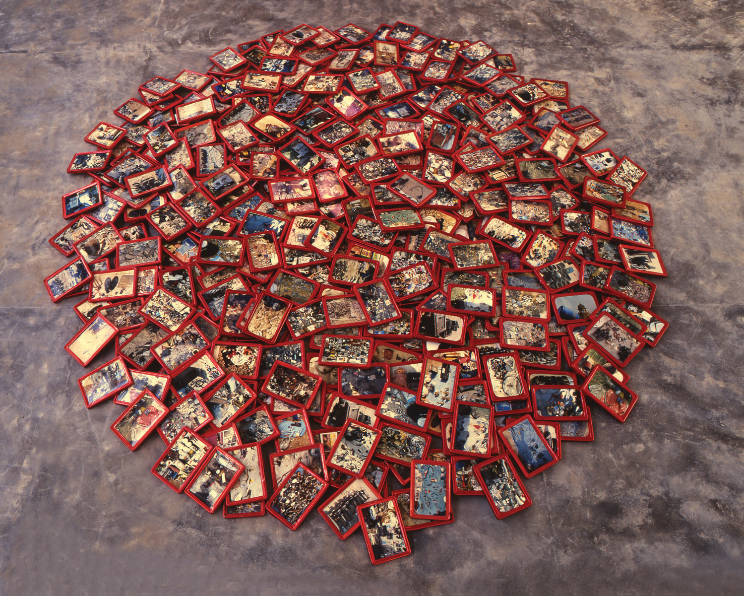
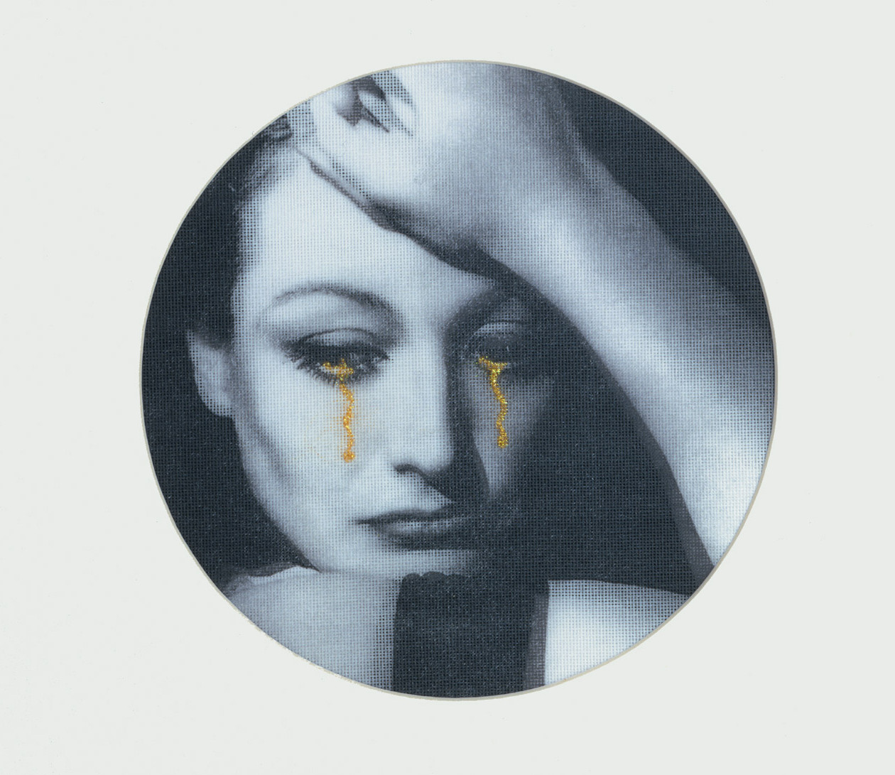
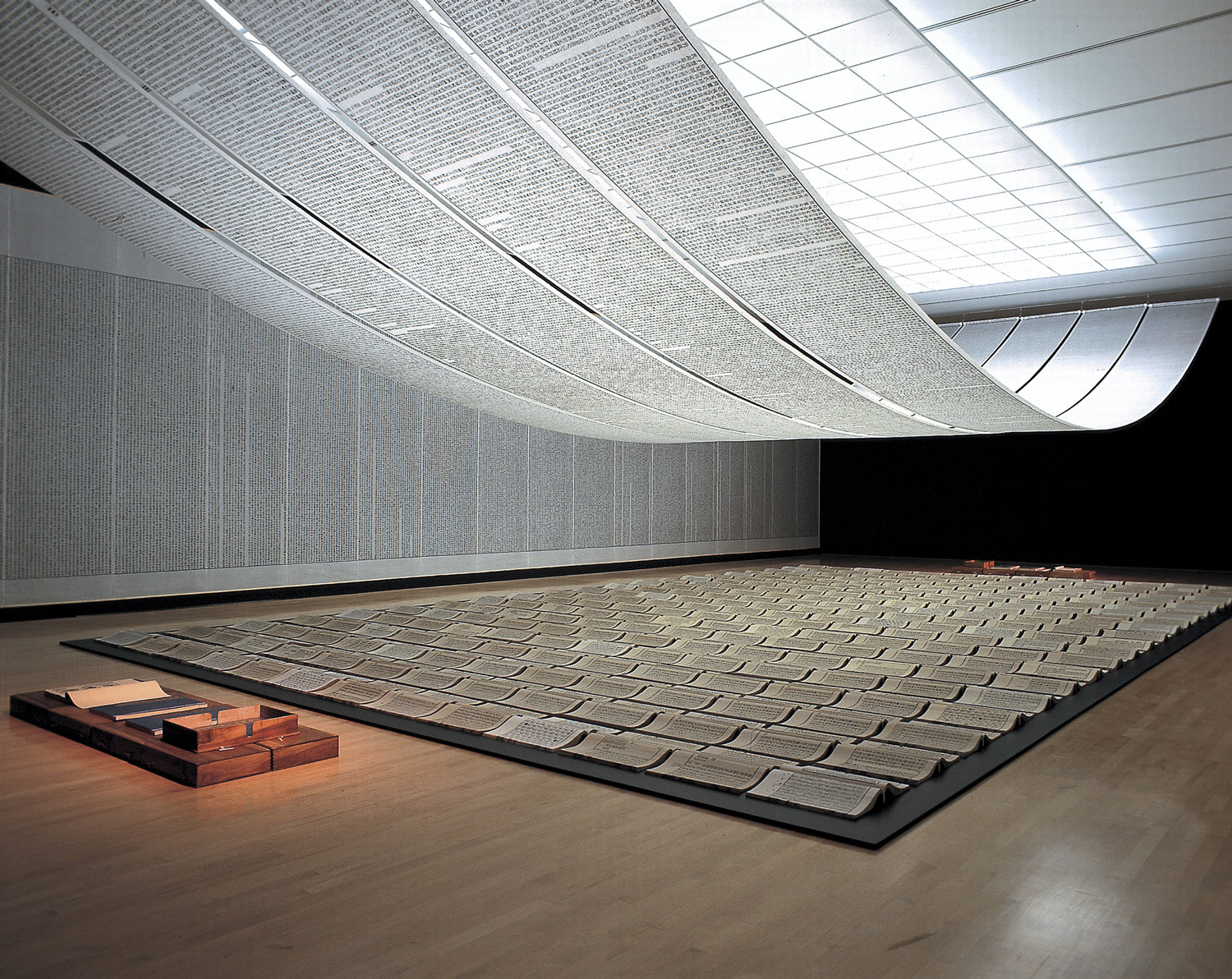
At the bottom, at street level, the building lifts its steel skirts and you look into a café through a glazed façade, into a public space for special exhibitions that is accessible free of charge. Its video art flickers out into the street at night, washing the sidewalks with reflected art. This is also intended as an invitation to local residents, just as everything about this building is intended to be inviting and to speak for itself: rather than the high drama of a temple to art, this building looks like a thoroughly well designed workshop for the present day. SANAA uses simple materials such as perspex, neon tubes and wire mesh, and manages to stage all this so that it looks elegant, light, transparent and somehow generally iPod-like. Essentially, the museum is a tower of white cubes that have been slit open and made permeable — and it is entirely apt to read this as a symbolic statement about its programming, as evidenced by the first exhibition. Massimiliano Gioni, who co-curated the 4th Berlin Biennale, among other things; Richard Flood, the former head curator of the Walker Art Center in Minneapolis; and Laura Hoptman were the curators. They have created an exhibition called “Unmonumental,” showing sculptures consisting mainly of crumbling small scrap, broken everyday objects, the detritus of civilization in every shape and form, thus looking deliberately heterogeneous, screwed together, as if in a collage: what you get to see is art that does not try to explain ‘the world,’ ‘war’ and ‘mankind’ as large aesthetic entities, that does not cling dramatically to a sweeping concept of work that is distanced from life, but instead presents accumulated clumps of and collisions between private mythologies, references and idiosyncrasies, impenetrable, sometimes delicately balanced, but sometimes conveying a sense of brashness. This is art that derives its explosive force by refusing excessively individualistic emotional drama.
An astonishingly large number of German artists are featured, including Anselm Reyle, Manfred Pernice and Isa Genzken, and also discoveries such as Tobias Buche, a Berlin-based artist who arranges Internet printouts, photographs, media images and private memorabilia to create striking mnemonic mobiles. But Gioni claims that the exhibition as it is to be seen now is only a beginning. As the months pass, it is intended to change its character and so at the same time turn into a programmatic exhibition about exhibiting as such. The walls, still white at present, would gradually fill up with a proliferation of art. A number of artists are due to provide sound installations, including Trisha Donnelly and Anthony Burdin. Ultimately something that started out as a formally quite conservative sculpture will itself turn into a collage of images, shapes and sounds — and then when one of the invited artists goes out into the street, recites texts about war and love there and conveys the recitation by mobile phone to a receiver in the museum, this transmission work too is part of the program: the New Museum intends to work from a premise that is quite different from those followed by the great European and American contemporary art museums, who deliberately present art in their sacred halls as something sacred, from realms far distant from the world. The New Museum is closer to theater: this is not to be a place where things are collected, but where they are presented and unleashed upon each other; art will be shown that brings images, objects and sounds into the museum from the outside, cleans them at high pressure, pushes them together, takes them apart and releases them again.

The fact that the New Museum itself will change this life outside, thrusting it towards luxury gentrification, is a piece of bad dialectical feedback between art and life. As evening came, a black Range Rover raced down the Bowery like a pioneer troop from a hipster army and turned sharply into Bond Street where Herzog & de Meuron are just building a chaotic neo-Baroque luxury apartment complex. The company marketing thus likes to use proximity to the New Museum and the “new SoHo” in its advertising, while most artists cannot afford to live in the Bowery now. But the fact that a museum as beautiful as this is helping to drive out what it wants to show by its mere presence is not a problem in the Bowery alone.
The New Museum Compilation
The New Museum is a pile of six boxes, stacked unevenly, like a child’s blocks. Sometimes the blocks mount up in a pattern of setbacks like that of a traditional New York building; sometimes they jut out over open space in a way that suggests the architects had something more radical in mind.
The building is original, but doesn’t strain to reinvent the idea of a museum. “It almost looks like an Anselm Kiefer,” Lisa Phillips said as we walked through, and she was exaggerating only slightly.
(Paul Goldberger, The New Yorker)
New York is in the cultural doldrums. The city is bursting with gorgeous art exhibitions, but where is the raw energy? Where is the new blood, intent on upending the establishment? Today, once-rebellious talents often seem to be wandering lost in the constellation of celebrity, where they soon settle into complacency.
The New Museum is the kind of building that renews your faith in New York as a place where culture is lived, not just bought and sold. Its ethereal forms hover somewhere between the legacy of a fading bohemian downtown and the ravenous appetites of a society awash in new money. That the building is so artfully rooted in the present means that its haunting quality will probably deepen as the city ages around it.
(Nicolai Ouroussoff, The New York Times)
The first piece of art on view at the New Museum is not in the building but on it. Pinned onto the shimmering silver exterior like an “I [heart] NY” button on the lapel of a Prada jacket is Ugo Rondinone’s HELL, YES!, a huge, rainbow-hued, neon-lit gewgaw that radiates equal parts optimism and ironical knowingness—a pitch-perfect message for a stretch of pavement that witnessed the birth of punk rock. A bracing statement of impurity, the placement of this gigantic bauble on the museum’s façade intentionally deflates any pretensions to Frank Gehry–like authority. Appropriately titled “Unmonumental: The Object in the 21st Century,” the New Museum’s central exhibition distributes the work of 30 artists throughout the museum’s three main gallery floors. A display of sculpture as assemblage, the show accurately describes a significant trend in collage-based work that, unlike a movement, lacks a critical center and may in fact be at least partly a reaction to super-slick phenomena like Damien Hirst’s stupid jewel skull and the preening of certain auction-house gavelers.
(Christian Viveros-Fauné, The Village Voice)
“Unmonumental,” the inaugural 30-artist exhibition curated by Gioni, Hoptman, and Flood, is rife with signs of good curators working together while struggling against a shortage of space. The three-floor survey is insanely overcrowded, sometimes monotonous, and because so much of the art is cobbled together from knickknacks, it may strike uninitiated viewers as a weird sort of junk shop, particularly in this immaculate space. But “Unmonumental” is peppered with good work. Nothing in this show can be seen “all at once”; most of it involves amorphous, disorderly, or fragmentary structure and hybridity. “They grow like weeds,” as Gioni writes.
Think of the art in “Unmonumental,” as Hoptman writes, as the work of a “do-it-yourselfer in a basement with a glue gun. a D.J. . a search engine.” This art wants to be decoded and read as visual text.
Just off the third-floor elevator, Urs Fischer throws down an artistic gauntlet to a generation. His scrappy sculpture of a sword in a concrete boulder seems to say that if you can’t remove the sword of originality from the stone of history you can remove the stone itself, thereby creating a new sculptural situation.
(Jerry Saltz, New York Magazine)
To inaugurate its radical new seven- story building in Lower Manhattan, the New Museum delivers a show most institutions wouldn’t touch: an obstacle course of recycled trash, surrounded by completely blank walls. Almost every one of the works in “Unmonumental” has been constructed from found junk, in wholly unexpected ways. The 100 works on view, strewn over three floors and lit like a science lab by stark white fluorescent tubes, would be as pointed as they are peculiar if they didn’t seem so one-note in approach, material and scale.
The show features no other art to set off the sculpture. It suggests that artists, even with new money, new technologies and hybridization of media, may have backed themselves into a single, small corner, trading irreverence for cleverness. The fluorescent lights and currently empty walls also make the place seem as underground as a speakeasy, adding to a sense of discovery that flows from the unfamiliarity of many artists in “Unmonumental.”
(Linda Yablonsky, Bloomberg News)
The people at the New Museum built their strange, aluminum-clad ziggurat in lower Manhattan just like any other building. It was made from the ground up, a concatenation of concrete and steel, rising from the Bowery, a street once synonymous with alcoholism, homelessness and despair, to the height of 174 feet. But the New Museum works, and it works in part because its basic form suggests not just playfulness, but something supernatural as well. A mix of those two elements, an amalgam of brattiness and transcendence, silliness and the spiritual, would pretty much describe where the contemporary art world spends much of its time these days. By posing as something either built by God’s hand or by the hand of a prattling child, the New Museum manages something surprising for a building sandwiched into a relatively small space in an old neighborhood; it seems monumental.
(Philip Kennicott, Washington Post)

