Evoking the memory of the late artist and designer Donald Tobias Wong (1974–2010) sometimes feels like bringing back to life one of those downtown urban myths, the ones that leave a shadowy, immaterial influence on those who keep on working and evolving through art and life.
Vancouver-born, Wong emerged in the New York scene at the end of the 1990s and soon imprinted his audacious way of thinking and working on many of his peers. Nicknamed “the enfant terrible of the design world” by specialized publications, Wong was an expert at playing with artistic conventions — the readymade, appropriation, viral tactics, impersonation, provocation and societal commentary. He was a child of Dada, an orphan of Fluxus and a fierce champion and hacker of modernism. Within a ten-year career, he produced as little as was necessary for him to challenge and threaten, one by one, the legacies of 20th-century creativity. His ability to foreclose a specific cultural heritage and turn it into new physical and intellectual material felt, for those who embraced the celerity of his career, like incisive commentary on the whereabouts of postmodernism once applied to questions such as consumption, desire and ownership.
Five years following his departure — not forgotten but waiting to be rediscovered —
Flash Art contributor and Wong’s collaborator Cyril Duval a.k.a. Item Idem highlights the relevance of his practice.
A is for AS LONG AS IT LASTS
For the 2007 edition of Design Miami, Wong collaborated with his long-time accomplices, curators Aric Chen and Josée Lepage, on a pop-up tattoo parlor exclusively offering authorized artworks (by Vito Acconci, KAWS and Jürgen Mayer H., among others). The title of the project, As Long as It Lasts, was borrowed from Lawrence Weiner, who offered a SINK OR SWIM, YOUR ASS GETS WET tattoo, a reworking of an ephemeral tattoo design distributed at “Utopia Station,” itself originating from a drawing that Weiner showed at Regen Projects in the 1980s.
Approached by Flash Art, Weiner graciously commented on his (and thereby Wong’s) relationship to tattoo culture: “The interesting thing about tatouage as art is that the substance of the work remains with you after the first encounter.”
B is for BURBERRY
One of Wong’s early coups was the appropriation of the iconic Burberry pattern, which he gave away at art openings and on the street. The Burberry Buttons (1999) turned into a viral phenomenon so quickly that the brand issued a cease and desist letter forcing Wong to stop, only for later reproducing the buttons in their new collection. Appropriately commenting on this as a “knock-off of a knock-off,” Wong would go on to use similar tactics to his own advantage, constantly “sealing the deal” and turning the corporate world upside down with questions about copyright and authorship.

C is for COLETTE MEETS COMME DES GARÇONS
Wong produced several works inspired by and commenting upon fashion, a production field he was also highly curious about. For example, he turned an Issey Miyake “Pleats Please” dress into a “one-size-fits-all” iMac protector (Screen Cover, 2002); or dipped Tiffany & Co earrings in rubber, to be peeled as you go… out (Pearls, 2003).
A frequent collaborator of the Parisian concept store Colette, Wong was brought to Japan in 2004 by the store’s creative director Sarah Andelman for a solo show as part of a “Colette meets Comme des Garçons” ephemeral branding crossover endeavor. Here Wong remixed his own work, inserting it within some of Comme des Garçons’s iconic products: he presented his popular Mirror Puzzle in a matte-black limited edition; and he encapsulated diamonds in perfume bottles, or dipped the bottles in a specific acrylic medium so that customers could use chalk to write messages or use a key to etch graffiti on the surface. In the grand finale of this collaboration, Wong offered a strikingly aggressive take on luxury by filling the windows of Colette in Paris with iMacs displaying his Diamond Screensaver and painting the façade the boldest red.
D is for DISNEY
In spring of 2010 — a couple of weeks before his untimely passing — Wong started collaborating with Italian manufacturer Cappellini on early prototypes to be presented to the entertainment giant Disney. Frederick McSwain, the director of Cappellini’s New York showroom, who spearheaded the potential collaboration (at a time when Cappellini was already working with Disney on a range of licensed products) remembered Wong’s intention to adapt some of his most commercially successful patents (like his acclaimed wireless Light Switch) within the parameters of Disney’s aesthetic language. For instance, Wong’s Sun Jar — a receptacle that sustainably captures the sun’s rays to produce free light at night — would have been updated to present Peter Pan’s Tinker Bell blinking in a bottle. Echoing his This is a Lamp Starck-stunt breakthrough moment, Wong was planning to riff on the Campana Brothers’ signature style by producing a similar chair with Mickey Mouse dolls agglomerated within acrylic cubes.
E is for ETHER
Shortly after moving to New York in 1998, the young and then unknown Wong was documented in SoHo selling Dreams in the shape of air-filled cotton-candy bags for the cost of $1.00 each. The emotional poetry at work in such a simple gesture can, in retrospect, be appreciated as the very first milestone of his career.
Wong’s mother, Phyllis Chan, calls this piece her son’s “most important artwork. It showed the turning point in his art life. I could see Donald’s future in it — from nothing to something. I knew his dream would come true: you cannot touch the air, and you cannot hold a dream, but he would be a success” [Object(ing): The art/design of Tobias Wong, exhibition catalogue, Museum of Vancouver, 2012, p. 54].
F is for FLUXUS
In spite of his multiple influences, Wong was an heir of the mischievous and free Dada spirit and a fervent admirer of the Fluxus international avant-garde. A know-it-all on the subject, pretty much every work produced by Wong can be linked to this unpredictable and unapologetic movement. Fascinated by Fluxus founder and center of gravity George Maciunas, Wong in his early New York days went to work for Barbara Moore of Bound & Unbound, publisher of the ReFlux Editions and the only source for legally authorized reproductions of authentic Fluxus works.
In retrospect, Moore can be seen as the person who mentored the young artist and gave him intellectual and physical access to some of the most whimsical art materials of all time.
G is for GONZALES-TORRES
The notion of love in the perspective of human endurance towards life duration is ubiquitous and predominant within Wong’s work (think about projects like Hidden Diamond Ring, Killer Ring and Fucking Easter Bunnies). So it’s not surprising that Felix Gonzales-Torres was his favorite artist. Perfect Lovers (Forever) (2002), his version of Gonzales-Torres’s seminal work, features “two commercial clocks outfitted with atomic radio receivers that automatically synchronize to the U.S. Atomic Clock” so that the lovers’ heartbeats never fall out of sync. Legend says that this edition of three hangs in various private collectors’ homes, while Wong, an eternal romantic, kept his own artist’s proof above his bed, emptied of batteries, fixed in time but synchronized forever.
H is for HOLZER
What will probably be remembered as Wong’s most notorious project and the embodiment of his “readydesign” philosophy and appropriationist strategy involved artist Jenny Holzer. In 2000, Wong approached Holzer in the streets of New York and asked her to write one of her most famous truism (“Protect me from what I want”) on his forearm. Instantly turning this into a tattoo, and later giving back the copyright of the photography to Holzer, Wong forged his own brand of conceptualism that illustrates a sardonic fascination with modern-day consumption. Holzer recalls that “he came out of the dark and scared me. But later, when I read about Tobias and his work, I was glad to have had a little time with him, and flattered that he wanted a sentence” [Object(ing), p. 93].
I is for ITEM IDEM
I met Wong in the context of the “Colette meets Comme des Garçons” project in Tokyo, and still consider him my best friend, a mentor and one of the most important conceptualists of his generation. Wong and I would constantly play a kind of conceptual ping pong, stealing ideas from each other and/or replying to each other’s artworks. An example is “The Wrong Store,” an unauthorized Wrong Gallery-inspired gift shop that item idem first opened in Paris in 2006. Wong then presented his own version with Gregory Krum, director of retail at the Cooper Hewitt, Smithsonian Design Museum, the following year.
The most sensible and intangible documentation of this era of inspiration and collaboration between us is embodied in an “invisible page” published on the occasion of the fiftieth issue of the design publication FRAME, which had supported both of us since our early beginnings. Asked by the editors to collaborate within the new issue, we decided to work closely with them on the pagination of the publication itself. The project was announced in the table of contents with a quote from Antoine de Saint-Exupéry’s The Little Prince: “What is essential to the heart is invisible to the eye.” Between page 48 and 51, where the work was supposed to appear, page 50 was nowhere to be seen.

J is for JUDD
Some of Wong’s most iconic product designs blatantly appropriated aspects of other artists’ works. For instance, his Chair No.2 (2002) was conceived as an exact replica of Donald Judd’s 1979 pine chair, but was executed in glass, the only material Judd conspicuously avoided during his entire career. Well aware of U.S. copyright laws, Wong knew that he could retain the work’s copyright by simply inserting his own intellectual property into a given design in order to make it his own.
K is for KOH
Besides being a clear disciple of Warhol, Wong shared other attributes with Terence Koh, the Buddhist monk and scandaleuse art-world darling. Both Canadians of Chinese descent, the two studied at the Emily Carr Institute of Art & Design in Vancouver before moving to New York and both gaining recognition for encompassing the appeal for shock values and media stunts.
In another of his trademark prank, Wong was notorious for pretending to be asianpunkboy, the alter ego that Koh used during his rise to fame. Approached by Flash Art, Koh recalls his peer in poetry:
tobi a east west bicycle
gold circles in the eyes
secret east village bed
kind below the skin
cock whipped out
stones circling out
hidden spirit in
mr wong ring ring
somebody home
but where’s the door?
L is for LEWITT
In each of his works, Wong always intended to comment on specific episodes of Conceptual art. In typically effortless style, he glued together seven copies of Sol LeWitt’s book CUBE (1990), thereby producing his own book with the same name.
M is for McDonald’s
Wong was notorious for expertly flirting with the boundaries of the legal system. His Coke Spoon from the “Indulgences” series, developed in collaboration with Ju$t Another Rich Kid — and the cease and desist letter from McDonald’s it provoked — is a perfect example of his risk-taking courage and ability to simultaneously endanger his career and generate momentum within his practice. By gold-plating, and so turning it into a luxury consumption object of desire, an item which was not just industrially manufactured – a coffee stirrer that drug addicts would use in the 1980’s – but also a McDonald’s gadget, Wong turned a countercultural micro-phenomenon into a real media topic, thereby illustrating his keen eye for subtle social commentary.

N is for NY TIMES
Orchestrated by curator Josée Lepage as a post-mortem dedication to her friend and partner-in-crime, The Times of New York is a candle scented with the fragrance of newspapers. The subsequent ripple effect seemed as if it has been engineered by the artist himself: the producers of the edition were issued a cease and desist letter that forced them to retract the product from retailers and offer the candles in a censored (giveaway) edition, eventually emphasizing the impact of the artist’s practice and legacy.
As Lepage points out, Wong would often sign e-mails in a humorously sibylline manner that is apt in this case: “My 2 cents with 99 problems.”
O is for OPRAH
In 2008, Wong and collaborator Aric Chen were invited to produce the American Pavilion at the ExperimentaDesign biennial in Amsterdam. Encouraged to curate a small exhibition representing design in the U.S, the duo opted to recreate a living environment entirely built and decorated with licensed items legally purchased through the Oprah Winfrey Network giveaway program. The work was a humorous tribute to a standardized and idealized version of modern American comfort. As Chen would emphasize: “Tobi was more of a cultural commentator than a designer in the conventional sense; he was a master at turning consumerism back on itself. Along these lines, we decided to investigate arguably the most powerful arbiter in America at that time: not a retailer, magazine editor or curator, but Oprah. Her annual gift giveaways provoked a kind of fetishistic hysteria, along with a massive boost in sales of the products on offer, that captured a certain relationship that many Americans have with their things.”
P is for PARACONCEPTUAL
Quickly after his career started taking off in the early 2000s, Wong’s self-debunking response to the media’s feeding frenzy was to define his own label/brand of conceptualism by appropriating Susan Hiller’s term “paraconceptual.” An extension of the notion of “paradesign,” it’s the perfect semantic example of his unwillingness to be pigeonholed into categories he felt limited his practice. Understanding that his work embodied the raw power of obviousness, he would go on to comment that “leaving room for meaning is a cheap cop-out — the best designers/artists have always been focused on what and how they want to be read. Leaving room for meaning is for those not so confident in their ideas” [Object(ing), p. 25].
R is for RASHID
September 11th deeply impacted Wong’s practice. Many of his iconic works in the early 2000s (Bulletproof rose, Box Cutter, Pocketbook, Pentagon Sofa) used the field of product design to comment on society’s desperate need for security in an age of fear, obscurantism and the regression of individual freedoms. Obtaining an early edition of playboy designer Kareem Rashid’s book I Want to Change the World, Wong commissioned artist Robert The to cut the book into the shape of a gun — a cheeky commentary on the ironic limitations and pseudo-ambitions of design in a time of turmoil. In his slightly cynical trademark humor, Wong would simply comment on this piece on “how to kill two birds with one stone” [Object(ing), 2012].

S is for STARCK
Wong’s This is a Lamp (2001) is his most emblematic and fearless appropriation of Duchamp’s legacy. Ahead of the official premiere of Philippe Starck’s Bubble Club Chair, Wong obtained from manufacturer Kartell — or so the myth says — a sample of the star designer’s chair and effortlessly altered it into a lamp. He would resume the ambitious gesture of his debut as “not a readymade, but a readydesign.”
Wong’s (still functioning) website brokenoff.com would pound this statement even more vehemently: “My intention is to make consumerism the design rather than a shopping strategy. I consume a Philippe Starck chair and produce a lamp. The process can make even an ‘original’ piece glow with light and romance.”
T is for TERMINAL 5
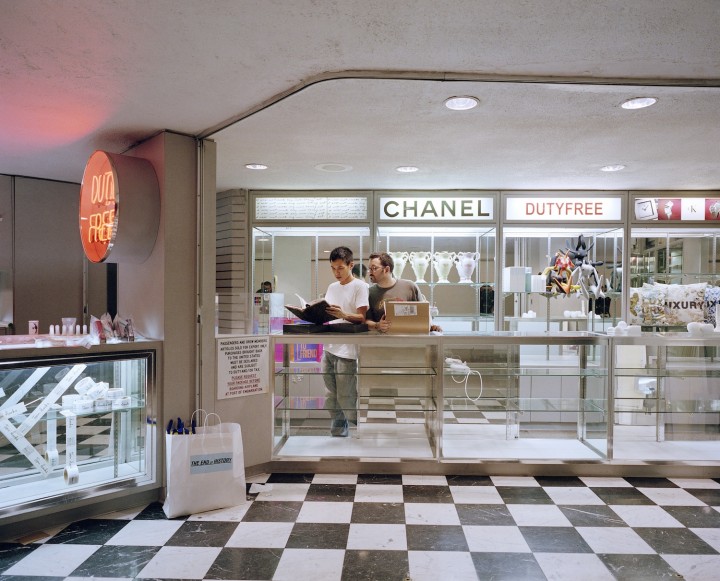
As stated above, Wong felt deeply affected by the post-9/11 obsession with security: 9/12 (2004), his curated gift shop in the Eero Saarinen Terminal 5 of New York’s JFK airport feels a posteriori like a perfect — although slightly sadly ironic — embodiment of the constricted and self-obsessed decade Wong worked within and commented upon. Ambitiously presenting Wong’s own design pieces and artworks he curated (from Printed Matter, Art Metropole or Colette) or specifically commissioned, the project closed (along with the entire exhibition, which also included contributions by Jenny Holzer, Vanessa Beecroft and Tom Sachs) just a day following its opening party due to unresolved and obscure security measures.
V is for VANCOUVER
Wong studied in Vancouver at the Emily Carr Institute of Art & Design before moving in 1998 to New York to enter the sculpture program of the Cooper Union School of Art. Nonetheless, the artist kept close ties with his hometown and its cultural avant-garde. Writer and artist Douglas Coupland — with whom he shared a mischievous spirit — remembers Wong’s inner acknowledgment of his own talent and “smiling at being able to take modernism, and rather than riffing on it, improving it” [Object(ing), p. 39].

W is for WARHOL
Many of Wong’s conceptual maneuvers can be characterized by their simultaneous radicality and self-explanatory simplicity. His 2002 contribution to New York boutique TROY’s Christmas campaign shows the artist at his most cheekily ambitious: as an exclusive service for guests, Wong offered Warhol Gift Wrap using original screen prints by the artist. Prices for the service varied between $7,500 and $25,000. No doubt someone we know would have appreciated the gesture.

